Before you can improve anything, you need a clear picture of what's happening right now. Trying to boost your website's conversion rate without first setting a baseline is just guesswork. It's about trading assumptions for hard data so you can build a real strategy.
This initial audit means we need to get specific. We'll define what a "conversion" actually means for your business, figure out how to measure your current performance accurately, and then hunt down the exact spots where potential customers are dropping off.
Establishing Your Conversion Baseline
Think of this as finding the "you are here" marker on a map. Without it, you're just wandering. This first step is non-negotiable for any serious conversion rate optimization (CRO) project. It's where we move beyond vanity metrics like raw traffic numbers and start focusing on the actions that truly drive your business forward.
Defining What Truly Matters
What's the most valuable action a visitor can take on your site? The answer is unique to your goals. A meaningful conversion isn't just a click; it's a specific outcome.
For instance:
- Marketing & Sales: This could be a "Request a Demo" form submission or a key whitepaper download.
- Product Teams: Success might be a user finishing the onboarding process or upgrading to a paid subscription.
- HR & Recruiting: A completed job application is the ultimate goal.
Once you nail down these key actions, you need to set them up as trackable goals in your analytics platform, like Google Analytics. This ensures that every change you make is measured against the metrics that actually matter to your bottom line.
This whole baseline process really boils down to three core ideas: get your measurement right, understand the user's path, and see how you stack up.
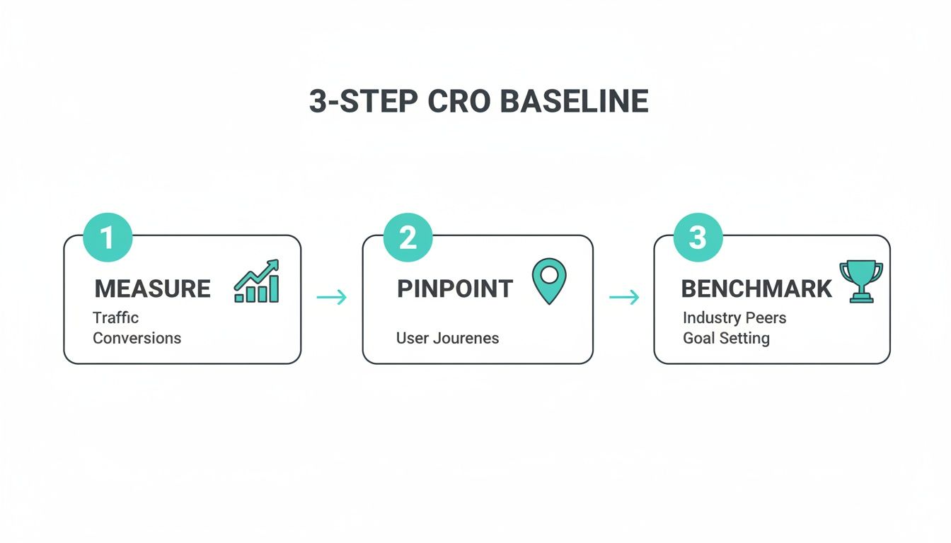
This simple framework keeps your efforts grounded in reality, starting with solid data and ending with a clear view of where you stand.
Auditing Your Conversion Funnel
With tracking in place, it's time to map out your conversion funnel. This is the step-by-step journey a visitor takes to complete one of your goals. More importantly, it shows you exactly where people are giving up and leaving.
Are they bailing when they see your 20-field contact form? Or is the pricing page the big drop-off point? Pinpointing these leaks is where the real work begins.
Context is everything here. Knowing how you compare to others helps you set realistic targets. Consider that in 2025, the average website conversion rate across fourteen major industries was only 2.9%. That number covers everything from a simple form fill to a major sale. It also tells us there's a huge opportunity for improvement, especially when you see that global e-commerce cart abandonment rates climbed above 70% in 2024.
Key Conversion Rate Benchmarks by Industry
Use this summary of average conversion rates across sectors to see how your performance compares.
| Industry | Average Conversion Rate (Paid Search) | Key Takeaway for Optimization |
|---|---|---|
| Legal | 7.4% | High-intent searches mean trust is paramount. Optimize for clarity, credentials, and easy contact. |
| Finance & Insurance | 5.1% | Simplify complex offers. Build trust with social proof and clear, transparent pricing. |
| B2B Services | 3.0% | The journey is longer. Focus on providing value through content (webinars, case studies) and clear CTAs. |
| Real Estate | 2.6% | Visuals are key. High-quality images, virtual tours, and easy-to-find contact info are critical. |
| eCommerce | 2.0% | The checkout process is the biggest leak. Reduce friction with guest checkout and simple forms. |
These numbers aren't just for show; they give you a vital reference point. If your industry's average is 3% and you're stuck at 1%, you know there's a lot of ground to gain.
Key Takeaway: Your initial audit is about more than just crunching numbers. It's about piecing together the story of your user's journey—what they want, where they get stuck, and how your site measures up against the competition.
With a solid baseline established, every change you make from here on out is a calculated experiment, not just a shot in the dark. To get a head start, check out these top strategies to improve website conversion rates. And for more ideas on attracting the right audience from the very beginning, don't miss our guide on https://tryformbot.com/blog/lead-generation-best-practices.
Winning with Website Speed and a Killer Mobile Experience
In a world where attention is the most valuable currency, your website's speed is the first impression you make. It's a non-verbal promise to your visitor that you value their time. A slow-loading site breaks that promise instantly, and it’s one of the most common ways businesses accidentally sabotage their own conversion efforts.
Every single millisecond matters. Think about it—patience is a limited resource, especially for someone browsing on their phone. If your page lags, they aren't going to stick around to admire your brilliant copy or perfectly designed call-to-action. They're just going to leave.

How Speed Directly Translates to Revenue
The connection between how fast your site loads and how many people convert is direct, measurable, and often shocking. Just look at Walmart—they discovered that for every one-second improvement in page load time, their conversions jumped by 2%.
This isn't some isolated fluke; it's a fundamental truth of user experience in 2026. The trend is only getting stronger, with Google's Core Web Vitals updates making speed and stability a core part of how they rank websites.
Now, layer in the fact that traditional forms often try to load every single field at once. This creates a huge delay on mobile, where conversion rates already lag at a painful 1.8% compared to desktop's 3.9%. It’s no wonder global form abandonment rates can spike to over 70%. That friction is a conversion killer. If you want to dive deeper into the numbers, check out this in-depth analysis of 2025 conversion rates.
So, where do you start? Pop your URL into these two tools:
- Google PageSpeed Insights: This is Google’s own report card. It gives you the raw data on your Core Web Vitals and provides specific, actionable advice for both mobile and desktop.
- GTmetrix: This tool provides a clear performance score and helps you pinpoint the exact culprits, whether it’s unoptimized images or a slow server.
Honestly, the biggest speed killers are often the easiest to fix. You can get huge wins by compressing large images, cleaning up clunky code (CSS and JavaScript), and using browser caching so your site loads instantly for repeat visitors.
Adopting a True Mobile-First Mindset
That huge performance gap between mobile and desktop isn't a problem—it's an opportunity. But a mobile-first approach is more than just having a "responsive" design that squishes to fit a small screen. It’s about completely rethinking the user's journey from the perspective of someone holding a phone.
This means designing for thumbs, not a mouse. It means building lightweight experiences that snap to life, even on a spotty 4G connection. Every single element on the page needs to earn its spot and guide the user toward converting.
My Two Cents: A mobile-first strategy forces you to be ruthless with your priorities. If an element doesn't directly help the user or your conversion goal on a small screen, it's just noise that's slowing things down. Get rid of it.
Take your forms, for example. On a big desktop screen, a long form with a dozen fields might seem okay. On a phone, it's a terrifying wall of text. Breaking that process into small, manageable steps is absolutely essential for improving the mobile experience and your bottom line.
Quick Wins for a Faster Mobile Site
Closing that mobile conversion gap requires a real focus on performance. This is non-negotiable if you're serious about increasing your website conversion rate in 2026.
Here are a few things you can do right now:
- Optimize Your Images: Use modern formats like WebP, which offer fantastic compression. Make sure you're serving images sized for mobile screens—don't make someone download a giant desktop banner on their phone.
- Implement Lazy Loading: This is a game-changer. It tells the browser to only load images and videos when the user actually scrolls to them, making the initial page load feel lightning-fast.
- Streamline Your Navigation: Use a simple, clear menu (like the classic "hamburger" icon) and make sure your buttons and links are big enough for a thumb to tap easily.
- Simplify Mobile Forms: This is huge. Ditch the long, intimidating form and break it into multiple steps. A one-question-at-a-time approach feels conversational and is perfectly suited for how people use their phones.
By treating speed and mobile usability as the foundation of your strategy, you’re showing users you respect their time. That builds instant trust and removes the friction that causes so many potential customers to bail before you even get a chance to show them what you've got.
Redesigning Forms Into Conversations
Think of your forms as the final handshake—that last critical step before a visitor becomes a customer, a lead, or even a new hire. But this is exactly where so many experiences fall apart. A long, intimidating grid of empty boxes feels more like an interrogation than an invitation, causing even your most interested prospects to second-guess and click away.
This friction is a nightmare on mobile devices. Tapping through a dozen tiny fields on a small screen is a recipe for frustration and one of the biggest reasons potential conversions just vanish. The psychology is simple: a long form looks like a lot of work, and people will do almost anything to avoid a chore.

From Intimidation to Interaction
The real fix isn't just a prettier form; it's changing how you think about data collection altogether. Stop treating it like a static document and start designing it like a friendly, guided conversation. This one shift fundamentally changes how the user perceives the task. Instead of a daunting wall of questions, they're greeted with a single, simple prompt. You've turned a chore into a dialogue.
This conversational approach has some powerful psychological wins:
- It kills cognitive overload. Asking one question at a time makes the whole process feel light and manageable.
- It builds momentum. Every easy answer feels like a small victory, which makes users far more likely to finish.
- It just feels more human. A natural, chat-like flow is way less intimidating than something that looks like a tax document.
This is where a tool like Formbot can be a game-changer. As a no-code platform, it lets you build these chat-like experiences in minutes. Instead of throwing all the fields at the user at once, it guides them one question at a time, making the whole thing feel effortless.
The Power of Conversational UI on Mobile
If you want to unlock higher conversion rates, you have to win on mobile. Data from 2026 shows a massive gap between desktop e-commerce conversion rates (3.9%) and mobile's disappointing 1.8%. That difference is almost entirely due to friction on small screens, which contributes to a cart abandonment rate over 70%. Making your forms feel native to a phone is a huge opportunity. You can see more of these device-specific conversion trends on Statista.com.
Formbot was built for this mobile-first world. Its chat UIs are a natural fit for mobile devices and can deliver higher completion rates. By guiding users through a simple dialogue and understanding natural language, it can pull out details intelligently and is faster than clunky, traditional forms.
Key Insight: The goal isn't just making your forms look better on mobile. It's about completely redesigning the experience of filling them out. A conversational flow turns a tedious task into a quick, intuitive interaction that feels perfect for a small screen.
Practical Steps to Better Form Conversions
You don't need a massive overhaul to turn your static forms into high-converting conversations. It really comes down to a few core principles.
First, be absolutely ruthless about the information you request. Every single field you add increases friction and lowers your completion rate. Ask yourself: is this data essential right now, or can I get it later? Only ask for what you need to take the very next step.
Second, think carefully about your language. Ditch the cold, robotic field labels like "First Name" and "Last Name." A Formbot experience, for example, might start with something as simple as, "Hi there! What's your name?" This tiny shift in tone makes the entire interaction feel more personal and engaging. For a deeper look at these ideas, check out our guide on essential form design best practices.
Once you've grasped how to make forms conversational, you can go even deeper into optimizing your lead capture forms to really maximize lead generation. By meeting users where they are, you remove the friction that kills conversions and make the final step of their journey the easiest one.
Earning Their Trust: Social Proof and Irresistible CTAs
Alright, you've got a fast site and your forms are no longer a chore for users. Now we get to the fun part: the psychology of persuasion. To really move the needle on your conversion rate, you need to master two things: building rock-solid trust and giving people a clear, compelling reason to act.
This is where social proof and powerful calls-to-action (CTAs) come into play. They work together to turn a hesitant visitor into a confident new customer.
Think about it—we’re all a little skeptical online. Without trust, even the best offer feels risky. Social proof is your secret weapon against that hesitation. It shows visitors that other people, just like them, have already taken the leap and had a great experience. It’s the online version of choosing a packed restaurant over an empty one; you just assume the food is better.

The Many Faces of Social Proof
Social proof isn't a one-size-fits-all solution. It's a mix of different signals that build confidence over time. Your job is to sprinkle them strategically where they’ll have the most impact—right next to your conversion points.
Here are a few of my go-to types:
- Customer Testimonials: A real quote from a happy customer, paired with their name and photo, is pure gold. Stick these on your pricing pages or right beside a sign-up form.
- User Reviews and Ratings: That simple star rating system is a visual shortcut for "this is a good choice." In fact, visitors who check out reviews are 58% more likely to convert.
- Case Studies: For B2B, nothing beats a detailed story showing exactly how you solved a tough problem for a client. It’s tangible proof of your ROI.
- Trust Badges: Think logos of well-known clients, security seals (like SSL certificates), or industry awards. These are instant credibility boosters that signal you're legit.
By weaving these elements throughout your site, you’re constantly reinforcing the message that choosing you is a safe and popular decision. It’s that quiet reassurance that often pushes someone over the finish line.
Pro Tip: Don't bury your best testimonials on a separate page nobody visits. Pull out the most impactful quotes and place them directly on your landing pages, right next to the CTA button. The closer the proof is to the point of action, the more power it has.
Crafting CTAs That People Actually Want to Click
After you've built that trust, the call-to-action is the final nudge. So many sites get this wrong with lazy, generic buttons. Words like "Submit" or "Click Here" are boring, and worse, they offer zero value to the user.
A great CTA is clear, concise, and focused on the benefit.
Get inside your user’s head. What do they get when they click that button? Your CTA copy needs to answer that question instantly. Instead of a generic "Submit," try something action-oriented like "Get My Free Demo" or "Start My 14-Day Trial." See the difference? You're shifting the focus from what they have to do to what they're about to gain.
Of course, the design is just as critical as the copy. Your CTA needs to visually jump off the page.
- Use a Contrasting Color: Pick a color that stands out from your page's background. It should draw the eye immediately.
- Make It Big Enough: The button has to be easy to spot and tap, especially on a phone, but not so big that it's obnoxious.
- Give It Breathing Room: Don't clutter the space around your CTA. A little white space makes it the undeniable center of attention.
When you combine compelling, value-first language with smart, eye-catching design, your CTA becomes an unmissable guidepost. It points users exactly where you want them to go and makes it easy for them to say "yes."
Turn Guesswork into Growth with Continuous Testing
Here’s the thing about conversion optimization: it’s not a one-and-done project. There's no finish line. The moment you stop testing and improving is the moment you start falling behind.
Think of it less like a project and more like a process—a constant cycle of learning what your users want and giving it to them. This mindset shift moves you away from making big, risky bets based on gut feelings and toward making small, calculated changes that lead to steady, predictable growth.
Every part of your funnel, from the headline on a landing page to the color of a button, is just a hypothesis waiting to be tested. Data, not your team's opinions, should be the ultimate judge. This is where A/B testing becomes your best friend, turning optimization from a creative art into a data-backed science.
It All Starts with a Strong Hypothesis
A great test is never born from a random "what if?" idea. It starts with a strong, testable hypothesis that clearly predicts an outcome and, most importantly, explains why you expect it to happen.
It’s the difference between saying, "Let's try a green button," and saying, "Changing the button to green will increase clicks because it creates stronger visual contrast against our blue background, drawing the user's eye directly to the main call-to-action."
A solid hypothesis always has three key ingredients:
- The Change: What are you actually altering? (e.g., "Replacing our long-form with a conversational Formbot...")
- The Predicted Outcome: What metric do you expect to move? (e.g., "...will increase our form completion rate by 15%...")
- The Rationale: Why do you believe this will work? (e.g., "...because the one-question-at-a-time flow reduces cognitive load and feels less intimidating on mobile devices.")
Without this structure, you're just throwing spaghetti at the wall. With it, every single test—win or lose—teaches you something valuable.
How to Prioritize Your Tests for Maximum Impact
Before you know it, you’ll have a backlog of dozens of testing ideas, far more than you have the time or traffic to run. This is where ruthless prioritization comes in.
Not all tests are created equal. Some have the potential for massive wins, while others will barely move the needle. You need a simple way to decide where to focus your energy first.
My go-to advice: Always start with high-impact, low-effort ideas. A tiny copy tweak on your highest-traffic checkout page is a much smarter first move than a complete redesign of a blog post that gets 50 visitors a month.
A/B Testing Idea Prioritization Framework
I use a simple framework to score and rank testing ideas. It helps remove emotion and focus on what's most likely to deliver a return, fast. You just score each idea on its potential impact and how easy it is to implement.
| Testing Idea | Potential Impact (1-5) | Implementation Ease (1-5) | Priority Score (Impact x Ease) |
|---|---|---|---|
| Change CTA copy from "Submit" to "Get My Free Demo" | 4 | 5 | 20 |
| Test a traditional form vs. a conversational form | 5 | 4 | 20 |
| Redesign the entire homepage layout | 5 | 1 | 5 |
| Change the hero image on the pricing page | 3 | 4 | 12 |
This simple scoring system makes your priorities crystal clear. In this example, changing the CTA copy and testing a conversational form are the obvious winners to tackle first. They offer the biggest bang for your buck.
Analyze, Learn, and Do It Again
Once a test has run long enough to be statistically significant (seriously, don't end it early!), it's time to dig into the results. The goal isn't just to find a "winner." The real gold is in understanding why one version outperformed the other.
Did the new headline win because it focused on a specific pain point? Did the conversational form boost completions because it felt more like a conversation and less like an interrogation?
Every result, good or bad, feeds your knowledge and informs your next hypothesis. This is the engine of iteration—each test builds on the last. For a deeper dive, our guide on actionable conversion rate optimization tips is a great place to go next.
Embrace this cycle of hypothesizing, prioritizing, testing, and learning. Before long, you'll have a culture of continuous improvement where small, data-driven wins compound over time, turning your website into a powerful conversion machine.
A Few Common Questions Answered
As you start digging into conversion rate optimization, a few questions always seem to pop up. Let's tackle some of the most common ones so you can move forward with confidence and start boosting your website's performance.
What’s a Good Website Conversion Rate in 2026?
Everyone wants a number to aim for, but the truth is, a "good" conversion rate is all over the map. It depends on your industry, who you're selling to, and where your traffic comes from. The average across most industries sits around 2.9%, but aiming for average is a recipe for mediocrity.
The real pros, the top-tier sites in any niche, are often hitting 5-10% or even higher. A much smarter way to think about it is to benchmark against yourself. Focus on beating last month's numbers.
The goal isn't to chase some arbitrary industry stat. It's about consistently improving your conversion rate by applying the strategies we've covered, like speeding up your site and making the user's journey dead simple.
How Long Until I See Results from My CRO Work?
This is the classic "it depends" answer, but for good reason. How quickly you see results comes down to two things: how big of a change you made and how many people visit your website.
Simple tweaks—like changing a headline or rewriting a button's text—can show a clear winner in an A/B test in just a few weeks if you have decent traffic. Bigger overhauls, like redesigning your whole checkout flow or introducing a conversational form, can produce much bigger wins, but they'll naturally take longer to prove out.
If you don't get a ton of traffic, you just have to be more patient. It takes time to collect enough data to know for sure if your change worked. Remember, CRO is a long game. It’s all about making steady, incremental gains that add up over time.
Is There One Single Change That Gives the Biggest Bang for the Buck?
There’s no magic wand you can wave, but from my experience, the changes you make right at the point of conversion almost always have the biggest impact. This usually means the form or the checkout process.
Why? Because that's where the most friction lives. It's the moment of truth where a user has to decide if they're going to hand over their information.
Think about it in these real-world scenarios:
- For a marketing website: Swapping a long, intimidating lead form for a simple, chat-like experience is a game-changer. You're tackling the biggest point of frustration head-on.
- For an e-commerce store: Just removing a few unnecessary fields from the checkout form can slash your cart abandonment rate.
- For a careers page: Taking a massive job application and breaking it into a few easy steps can dramatically boost the number of people who actually finish it.
Beyond the form, the two most powerful changes you can make are improving your site's page speed and perfecting the mobile experience. A fast, intuitive site builds trust and gets out of the user's way, which is fundamental to getting anyone to convert.
Ready to transform your static forms into high-converting conversations? With Formbot, you can build an AI-powered, chat-like experience in minutes—no code required. See why businesses get higher completion rates and start your free plan today.


