The basic idea behind a fillable PDF form is simple: you take a static document and overlay it with interactive fields. Things like text boxes, checkboxes, and drop-down menus get layered on top so people can type directly into the document, completely skipping the old print-and-scan routine.
Why Does Creating PDF Forms Feel So Frustrating?
Let's just say it: making a fillable PDF form is often way more complicated than it has any right to be. You have a straightforward goal—get some information from someone—but you quickly find yourself wrestling with clunky software, annoying design constraints, and a flood of user complaints. It's an all-too-common headache that has a lot of us looking for a better way.
What should be a quick job morphs into hours of meticulously lining up fields, figuring out validation rules, and fixing the tab order so it makes sense. This is exactly why so many businesses are starting to question if PDFs are really the best tool for data collection anymore.

The Steep Learning Curve of Traditional Tools
Most people’s first instinct is to fire up a powerful program like Adobe Acrobat, but its complexity is a huge barrier. The overwhelming number of menus and options creates a steep learning curve that’s just plain discouraging. And this isn't just a feeling; it's a real problem. A staggering 70% of users report major difficulties when they first try to use these advanced editors, which often results in sloppy, error-filled forms.
The root of the problem is that these programs were designed for editing documents, not creating intuitive forms. It feels less like you're designing a good user experience and more like you're programming a document—a skill most of us don't have.
Poor User Experience and High Abandonment Rates
Even when you finally get the form built, the experience for the person filling it out is often terrible, especially on a phone. Nobody enjoys pinching and zooming just to type into a tiny text box. It's a surefire way to make people give up. In fact, data shows that mobile drop-off rates for PDF forms can be as high as 50%. That means you could be losing half of your responses before people even get to the end.
This problem is only getting bigger as the PDF editor software market expands. The market was valued at $5 billion in 2023 and is expected to soar to $15 billion by 2031, driven by the push for everything to be digital. But despite this growth, the form-building features in these tools just haven't kept up with what users expect from a modern, mobile-friendly experience. You can dig into the PDF editor software market trends for a deeper dive.
Don't worry, though. In the next sections, we'll walk through some practical ways to get around these challenges.
Mastering Form Creation in Adobe Acrobat Pro
When you need serious control over a fillable form, Adobe Acrobat Pro is the tool you reach for. It's the industry standard for a good reason. It offers a deep, powerful set of features for everything from simple text boxes to complex calculations and custom validation scripts.
I'll be honest, the interface can feel a bit much at first. But once you get the hang of its core workflow, what seems like a daunting task becomes surprisingly manageable. The entire process hinges on one key area: the Prepare Form tool. This is your command center for turning a static document—be it a scanned image or a file from Word—into a fully interactive PDF.
Start With a Solid Source Document
Before you even think about clicking that "Prepare Form" button, the quality of your source document is paramount. Acrobat is clever, but it can't read your mind. If you give it a well-structured document to start with, its automatic field detection feature will do most of the heavy lifting for you.
Here are a few tips I've learned over the years for prepping a source file:
- Label Everything Clearly: Make sure every spot where you want a form field has a clear label right next to it, like "Full Name" or "Email Address." Acrobat's algorithm actively looks for these text patterns.
- Give it Breathing Room: Don't cram your fields together. Leave plenty of white space around where you want text boxes, checkboxes, or signature blocks to go.
- Use Visual Cues: If you’re designing the document from scratch, adding simple underlines (
_______) or empty boxes can be a great visual cue for Acrobat, often improving the accuracy of its auto-detection.
A little bit of prep work here genuinely saves a ton of time on the back end. A clean, logical layout is the foundation of any good form.
Getting Around the Prepare Form Tool
With your source document ready, open it in Acrobat Pro and head over to the "Tools" center to select "Prepare Form." Acrobat will immediately ask if you want it to automatically find form fields. I almost always say yes. If you’ve set up your document well, you’ll see a bunch of blue boxes instantly appear over your labels, representing the fields it just created for you.
This is what the Prepare Form interface looks like once it's done its thing. Notice the toolbar on the right—that's where you'll find all the different field types you can add.
Now, even with a perfect source file, the auto-detection is rarely flawless. You'll probably need to make some manual tweaks—deleting stray fields, resizing boxes, or adding a few that it missed. That toolbar on the right side of the screen is where you'll do all this manual work.
Adding and Customizing Your Form Fields
The real power of Acrobat is in the sheer variety and customizability of its form fields. You can just drag and drop any field you need from the toolbar right onto your page.
These are the ones you'll use most often:
- Text Field: The workhorse for any form. Use it for names, addresses, and any open-ended questions.
- Check Box: Perfect for yes/no questions or letting people select multiple options from a list.
- Radio Button: Use these when a user must select only one option from a group (like "Beginner," "Intermediate," or "Advanced"). The key here is that all radio buttons in a single group must share the same name but have different export values.
- Dropdown List: Keeps your form looking clean and prevents typos when you have a long list of options, like all 50 U.S. states.
- Signature Field: Essential for official documents, allowing for a legally-binding digital or electronic signature.
My Pro Tip: Pay close attention to the alignment tools. A form with perfectly aligned fields just looks more professional and is way easier to fill out. Use the alignment, distribution, and sizing options found in the right-hand pane to create a clean, organized grid.
Setting Field Properties and Validation Rules
Just dropping fields onto the page is only half the battle. You have to configure them to behave the way you want. Double-clicking any form field opens up its Properties window, and this is where the real magic happens. This little dialog box gives you incredibly granular control over every aspect of that field.
From the Properties window, you can:
- Name Your Fields: Give every field a unique, descriptive name (e.g., "FirstName" or "PrimaryEmail"). This is absolutely crucial for managing data later on, especially if you're setting up calculations.
- Make Fields Required: On the "General" tab, just check a box to make a field mandatory. The field will get a red border, instantly signaling to the user that they can't skip it.
- Apply Formatting and Validation: Jump over to the "Format" tab to pre-format fields for specific data types, like numbers, dates, or ZIP codes. For an email field, you can even add a simple validation script to make sure the entry contains an "@" symbol. This one step can slash the number of data entry errors you get.
Taking the time to master these properties is what elevates a basic fillable PDF into a truly smart, user-friendly form. Trust me, the time you spend setting up proper validation and formatting in 2026 will save you countless headaches cleaning up messy data down the road.
Getting Started With PDF Forms in Your Everyday Software
You don’t always need fancy, expensive software to create a great-looking, fillable PDF. While tools like Adobe Acrobat Pro are the industry standard for a reason, you might be surprised to find powerful form-building features hiding in the programs you already use every day.
For simple projects—think internal surveys, basic registration sheets, or client intake forms—you can get the job done with Microsoft Word, Google Docs, or even the free and open-source LibreOffice Writer. This route saves you from subscription fees and a steep learning curve, making it a perfectly practical choice for many common scenarios.
Building Forms in Microsoft Word
Microsoft Word actually has a pretty robust set of form tools, but they're tucked away. First, you need to bring the Developer tab out of hiding. Just head over to File > Options > Customize Ribbon and tick the "Developer" checkbox.
With that done, you'll see a new tab loaded with form-building goodies in the "Controls" group. This is where you'll find everything you need to make your document interactive.
Here are the controls I find myself using most often:
- Plain Text Content Control: Your standard text box. Perfect for names, addresses, and other short-form answers.
- Check Box Content Control: Great for when users need to select one or more options from a list.
- Combo Box or Drop-Down List: This gives you a dropdown menu of predefined choices. It’s a fantastic way to keep responses consistent and avoid typos.
- Date Picker Content Control: A simple but effective pop-up calendar that lets users select a date.
Once you’ve placed all your form fields, there’s one last critical step: protecting the document. In the Developer tab, click Restrict Editing. This locks everything down except for the interactive fields, so people can't accidentally mess up your layout. Then, just save the file as a PDF, and Word will automatically make sure your form fields stay interactive.
This flowchart gives a nice visual overview of the process, helping you decide where to start.
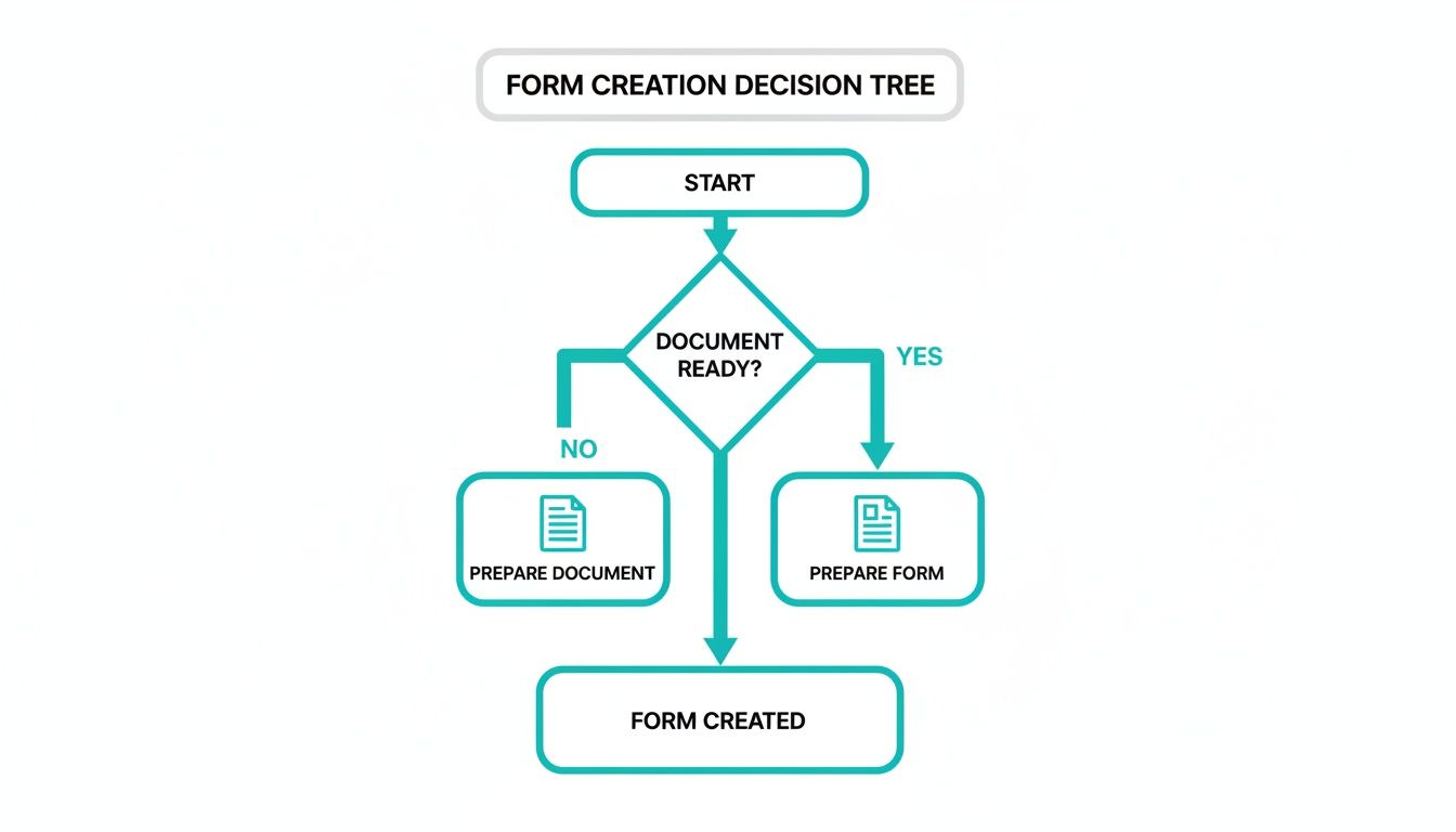
It helps you map out whether you should design the document layout first or, if your layout is already set, jump straight into adding the interactive form fields.
A Smart Workaround for Google Docs
Unlike Word, Google Docs doesn't have a direct "add fillable field" feature. But don't let that stop you. There's a clever workaround using tables that gets you a clean, functional layout for simple forms. Essentially, you're building a structure that looks and feels like a form, which people can fill out right in Google Docs before they save it as a PDF.
The trick is to create a two-column table. In the left column, you put your field labels like "Full Name" or "Email Address." The right column is left blank, creating a nice, clean space for users to type their answers.
This method doesn't create a truly fillable PDF with interactive fields. Instead, you're designing a well-structured Google Doc that’s easy for anyone to fill out. The user then downloads their completed version as a PDF.
It's a low-tech but surprisingly effective solution, especially in collaborative environments where a team might need to review or add to the document. The beauty is in its simplicity—anyone with a Google account can use it. If this approach feels a bit too basic for your needs, you might want to explore some of the best online form builders for more advanced capabilities.
Using the Open-Source Power of LibreOffice Writer
For anyone who loves free, open-source software, LibreOffice Writer is a fantastic alternative. It has built-in form controls that are surprisingly powerful and can go toe-to-toe with some of Microsoft Word's features.
To get started, you’ll need to activate the Form Controls toolbar by going to View > Toolbars > Form Controls. This opens up a whole panel of field options you can add to your document:
- Text Box
- Check Box
- Option Button (these are radio buttons)
- List Box (a dropdown menu)
- Push Button
Adding fields is as easy as clicking the tool and dragging a box onto your page. Double-clicking any field opens up a detailed properties menu where you can fine-tune everything from its appearance to its default values. A really handy feature in Writer is its "Design Mode" toggle. With it on, you can move and edit your fields. When you switch it off, you can test the form's functionality right there in the document before you even export it.
Once your design is perfect, exporting is the final step. Go to File > Export As > Export as PDF. In the pop-up window, just make sure the Create PDF form option is checked. This is the magic button that converts all your hard work into a fully interactive, fillable PDF.
For a more detailed walkthrough on crafting professional forms, this guide offers some great, practical tips on How to Create an Editable PDF Form. It goes to show that even in 2026, you don't need to break the bank to create effective forms.
Moving Beyond Static PDFs with Conversational Forms
After walking through the traditional ways to create PDF forms, you might be thinking there has to be a better way. All that manual work can feel clunky and outdated. What if you could ditch the "fill out this document" vibe and make it feel more like a conversation? That’s exactly where modern form builders are headed, leaving the rigid, static PDF behind for something far more dynamic and user-friendly.
Think about it: instead of presenting someone with a wall of fields, you ask questions one by one, almost like you're chatting with them. This approach immediately feels more personal and a lot less intimidating, especially on a phone. We've all been there—pinching and zooming on a PDF form, trying to tap a tiny checkbox. A conversational flow guides the user through the process with a clean, simple interface.
This isn't just about looking good; it's about getting better results. When you make a form easier and more engaging to fill out, you'll see a lot more people actually complete it.
The Problem with Traditional Form Building
Let's be honest—creating PDF forms the old-fashioned way can be a real headache. I’ve seen teams spend hours in Adobe Acrobat dragging and dropping fields, tweaking validation rules, and then testing endlessly to see if it even works on a smartphone. All that effort often leads to dismal results, with some complex forms seeing abandonment rates between 40-50%, mostly because the mobile experience is just plain bad. A quick look at insights on the PDF form builder market shows just how common this struggle is.
This is precisely why a new generation of tools is sidestepping that entire clunky process.
A Smarter Way to Create and Collect Data
Platforms like Formbot are built on a powerful idea: you shouldn’t need to be a designer to create a great form. Instead of painstakingly building your form field by field, you just describe what you need in plain English. For example, you could tell it, "Create a job application that asks for a name, an email address, a resume upload, and includes a short skills quiz."
In just a few seconds, the AI generates a fully functional, beautiful form that’s ready to share.
It turns a tedious task into a simple, chat-based experience.

The image above really captures the core idea: turning data collection into a dialogue. It's so much more engaging than a static document.
This approach means you don't have to write a single line of code or wrestle with complicated PDF software. The benefits are huge. Conversational interfaces can boost completion rates and cut the time it takes to fill out a form. For a busy HR department flooded with applications, that kind of efficiency is a game-changer. Our guide on how to create online forms dives even deeper into this.
The real win here is shifting your focus from document design to user experience. When you make your form feel like a natural conversation, you drastically lower the barrier to entry. More people will start, and more importantly, more people will finish.
By 2026, efficiency and user satisfaction are going to be even more critical. Making the switch to a conversational model solves so many of the frustrations of old-school forms. It’s a powerful, user-centric solution that gets you the data you need without the usual hassle. It’s all about meeting people where they already are—on their phones, in a chat-like environment they use every single day.
Designing Forms People Actually Want to Complete
Let's be honest: nobody loves filling out forms. But a well-designed form can be the difference between getting the information you need and having someone click away in frustration. The secret isn't just about making it look pretty; it's about creating a clear, simple path from the first question to the final "submit."
Good design is about empathy. You have to put yourself in the user's shoes. Simple changes, like putting fields in a logical order or grouping related questions, can transform a confusing chore into a smooth, straightforward process. These little things make a massive difference in completion rates.

Create a Logical and Intuitive Flow
The best forms feel like a natural conversation. You wouldn't ask for someone's deep, personal details before you've even asked their name. Start with the easy stuff first to get them rolling.
Try grouping related information into clean, distinct sections. It breaks the form into manageable bites and prevents that overwhelming "wall of fields" feeling.
- Personal Information: Name, Email, Phone Number
- Shipping Address: Street, City, State, ZIP Code
- Billing Information: (With a handy checkbox for "Same as Shipping")
Thinking about layout and visual hierarchy is also part of creating a good flow. Understanding some basic Desktop Publishing (DTP) principles can help you design forms that are not just functional but also professional and easy on the eyes.
Prioritize Clarity in Labels and Instructions
Vague instructions are a form's worst enemy. Every label and every piece of placeholder text needs to be perfectly clear. Ditch the internal jargon and use simple, direct language that anyone can understand instantly.
For example, instead of a label like "Dates," be specific: "Start Date (MM/DD/YYYY)." That small clarification eliminates any guesswork and prevents common formatting errors before they happen.
The goal is to make the user think as little as possible. If they have to stop and figure out what a field means, you’ve created friction.
If you want to go deeper on this, we've put together a comprehensive guide on form design best practices that's full of practical tips.
Accessibility Is Not an Afterthought
Designing for accessibility means ensuring people with disabilities can use your forms without a hitch. This is more than a box-ticking exercise; it’s a fundamental part of good design that ultimately benefits everyone. An accessible form is almost always a more usable form for your entire audience.
A huge part of this is keyboard navigability. Can someone move through your form fields using only the Tab key? This requires setting a logical tab order so the cursor moves from one field to the next exactly as you'd expect. Get this wrong, and tabbing through the form becomes a chaotic mess, jumping from the first field to the last and back again.
As user expectations evolve, designing with accessibility in mind will only become more critical by 2026. It's about being inclusive and ensuring every single person has a positive experience.
Got Questions About Making PDF Forms? We’ve Got Answers.
Even with the best instructions, you're bound to hit a few snags when you're deep in the process of building a fillable PDF. I've been there. This section is your go-to guide for those common "what the...?" moments. I’ve pulled together the questions that pop up time and time again to help you get unstuck fast.
It makes sense why these issues are so common. We're swimming in a sea of PDFs—over 2.5 trillion of them exist, with 290 billion more joining the pile each year. The need for good, working forms is massive. Yet, the tools we often use can feel like they're working against us. It's a well-known pain point; one survey found that 65% of users get fed up with the clunky editing in programs like Acrobat. You can read more about the PDF market's rapid expansion and user challenges if you want to dive deeper.
This gets even trickier on mobile, which is where a staggering 60% of forms are opened. A static, clunky PDF just doesn't cut it on a small screen.
What Is the Best Software to Create a Fillable PDF?
Ah, the million-dollar question. The honest, expert answer? It really, really depends on what you're trying to do. There’s no single "best" tool for every job.
For the Power User: If you need the absolute maximum control—think complex calculations, tricky validation rules, or legally binding digital signatures—then Adobe Acrobat Pro is still the king. It has a notoriously steep learning curve, but its power is unmatched for serious, professional-grade forms.
For Simple, Free, and Fast: Don't overlook the tools you already have. Microsoft Word and LibreOffice Writer are surprisingly capable of creating basic fillable forms. If you just need some text boxes, checkboxes, and a dropdown menu for an internal company form, these are perfect. No extra cost, no new software to learn.
For a Modern, User-First Approach: When your main goal is getting people to actually complete the form, especially on mobile, look at tools like Formbot. They flip the script by using a conversational, chat-style interface. Instead of a sterile document, it feels like a guided conversation, which is a fantastic way to improve completion rates.
Your choice of software should be a direct reflection of your project's complexity and who you're building it for. Don't overspend on features you'll never touch, but don't cut corners on the user experience if it's a top priority.
How Do I Make Sure My Form Is Secure?
This is a big one, especially if you're handling personal data, financial details, or anything else sensitive. A standard PDF you email out is about as secure as a postcard—once it leaves your outbox, you have no control.
Here are a few ways to lock things down:
Password Protection: This is your first line of defense. Most PDF editors, Acrobat included, let you set passwords. You can have one password just to open the file and a separate one to prevent someone from editing, printing, or copying the contents.
Encryption: When you save your PDF, dig into the advanced or security settings. You should find an option to encrypt the file. This essentially scrambles the data, making it unreadable to anyone who doesn't have the key (your password).
Use a Secure Platform: Honestly, for truly sensitive information, a dedicated online form builder is the safest bet. These platforms are built for security from the ground up. They handle submissions over encrypted connections (HTTPS) and store the data in protected databases, taking the security burden off your shoulders.
Why Aren’t My Form Fields Working After I Save as PDF?
I hear this one all the time. It’s incredibly frustrating to spend an hour placing fields perfectly, only to find they're just flat, unclickable text in the final PDF.
Nine times out of ten, the culprit is your export settings. In programs like Word or LibreOffice, you can’t just use the standard "Save As PDF" or "Print to PDF" option. That flattens everything.
You need to look for a specific "Export as PDF" function. Inside that dialog box, there will be an option you have to check—it's usually labeled something like "Create PDF form" or "Include interactive fields." If you don't tick that box, all your interactive elements get squashed into a non-interactive image. Trust me, double-checking this one little box will save you a world of pain. Even by 2026, this is still one of the most common user errors I see.
Ready to skip the headaches of traditional PDF forms entirely? Formbot uses AI to build beautiful, conversational forms in seconds. Just describe what you need, and let our platform create an engaging experience that boosts completion rates and delights your users. Build your first form for free at https://tryformbot.com.


