
Before you even think about dragging and dropping fields or picking a color scheme, let's talk about the most crucial part of building a form that actually works: the planning. I've seen countless well-designed forms fail miserably, and it almost always comes down to a weak foundation.
A great form isn't just a list of questions. It’s a strategic conversation designed to hit one specific goal. Skip this initial thinking, and you’re basically building a leaky bucket.
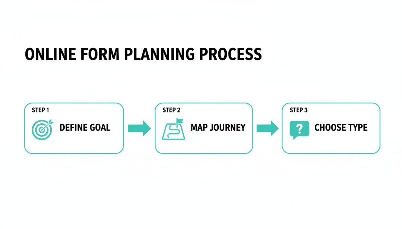
Laying the Groundwork for a High-Converting Form
The real work happens before you open your form builder. This is where you get laser-focused on what you need to achieve. Is this form meant to pull in qualified sales leads? Register people for your next big webinar? Or maybe it's for collecting honest feedback from your customers?
Picking one primary goal is your guiding light. It stops you from cluttering the form with "nice-to-have" questions that just annoy people and cause them to bail.
Define Your Form's Core Purpose
Ask yourself this: "If this form could only do one thing perfectly, what would it be?" This single question will bring incredible clarity. Every field you add creates friction, so you have to be ruthless.
For instance, if you're building a lead gen form for a B2B service, you probably just need a name, work email, and maybe company size. Asking for a personal phone number right out of the gate? That's a classic conversion killer.
Once you’ve nailed down your goal, put yourself in your user's shoes. Think about their journey:
- What’s their motivation? Are they after a free guide, a product demo, or help with a problem?
- What might make them hesitate? People are wary of spam, long forms, and how their data will be used.
- What’s the absolute minimum you need? Question every single field. If you can live without it, cut it.
This mindset—respecting their time and focus—is the secret sauce for getting more people to hit that submit button.
Traditional vs Conversational Forms
Next up is a big decision: the format. Are you going with a classic, static form where all the fields are laid out at once? Or will you use a more modern, conversational approach that asks one question at a time?
A conversational form turns the chore of filling out fields into a simple chat. It feels more like a friendly dialogue and less like paperwork, which dramatically lowers the mental effort required from the user.
This approach is a game-changer on mobile, where scrolling through a long, dense form is a nightmare. Presenting one simple question at a time guides the user smoothly from start to finish.
The industry is clearly moving in this direction. The global online forms market is already valued at around $3.1 billion and is expected to hit $5.8 billion by 2033. That kind of growth shows just how vital smart, user-friendly data collection has become. You can read more about the market trends to see where things are headed.
Building an Intelligent and Interactive Form Flow
Okay, you’ve got your strategy mapped out. Now it’s time for the fun part: actually building the thing. The great news is that modern tools have completely changed the game. You're no longer staring at a blank screen, trying to figure out where to start.
Instead, many form builders now have AI assistants. You can literally just tell it, "I need a form to register people for a webinar," and poof—it generates a solid first draft in seconds. This gives you a massive head start, letting you jump straight into tweaking and perfecting the user experience instead of getting bogged down in the basics.
This build phase is where the planning you just did really pays off.
Defining your goal, mapping the user journey, and picking the right form type—this foundation ensures you’re not just building a form, but a tool designed to get a specific job done.
Selecting the Right Fields and Rules
Once you're in the builder, it's all about making smart choices for each question you ask. The type of field you choose can make or break the user's experience. While a simple text box works for a name, don't sleep on the more advanced options. They make life easier for your users and keep your data clean.
- Date Pickers: No more guessing if someone meant MM/DD/YYYY or DD-MM-YY. A calendar interface makes it foolproof.
- File Uploads: Essential for things like job applications (resumes) or support tickets (screenshots).
- Dropdown Menus: Perfect for when you have a set list of options, like states or job titles. This guarantees you get standardized answers.
- Multiple Choice: Lets people click-click-done instead of typing out a long response.
Just as crucial are the smart validation rules you set up. Think of these as helpful guardrails. They can instantly check if an email address actually has an "@" symbol or if a phone number has enough digits. The key is to provide gentle, real-time feedback that helps people fix mistakes on the spot—not a big, angry error message after they've already hit "Submit."
Mastering Conditional Logic for a Personal Touch
This is where your form goes from a static list of questions to a dynamic, interactive conversation. Conditional logic (sometimes called branching logic) is the magic that shows or hides questions based on how someone answered a previous one. It’s the secret to making your form feel less like a chore and more like a personal consultation.
By only showing relevant questions, you dramatically shorten the form for each individual. This cuts down on friction and makes the whole experience feel like it was designed just for them—a surefire way to boost your completion rates.
Here’s a classic example: imagine a feedback survey. If someone rates their experience as "Poor," a new question could instantly appear asking, "We're sorry to hear that. What could we do better?" That question stays hidden for everyone who had a great experience. You get richer, more specific feedback, and the user feels heard.
You’ll see this logic at work in tons of high-performing templates. A well-built lead capture form, for instance, might ask different follow-up questions depending on the user's industry or company size, helping to qualify the lead right then and there. This intelligent flow is what separates a good form from a great one.
4. Design for Mobile Users and Maximum Conversions
With the logic and flow of your form mapped out, it's time to focus on the design. This isn't just about picking pretty colors; the visual experience of your form directly impacts whether someone will actually complete it. A clean, intuitive design feels effortless, but a cluttered one is a guaranteed way to send people running.

This is a massive deal, especially when you look at the numbers. While over 60% of all form submissions happen on mobile, a wild 84% of people admit they'd rather fill them out on a desktop. You can dig into more of these user habits in this full online form statistics report.
What does this tell us? People are starting on their phones but are so often frustrated by the clunky experience that they give up, hoping to finish later on a bigger screen. Your job is to bridge that gap with a design that’s genuinely built for mobile, not just squeezed onto it.
Create an Obvious Visual Path
On a small screen, clarity is king. Your user needs to know exactly what to do next without having to pinch, zoom, or squint. This is where a strong visual hierarchy saves the day, guiding the user’s eye from the title, to the question, to the input field, and on to the "next" button.
This is where a one-question-at-a-time, conversational flow really shines on mobile. It completely removes that overwhelming feeling of seeing a dozen fields crammed onto a tiny screen. By focusing the user on a single, simple task, you slash their cognitive load and make the whole thing feel more like a friendly chat than an interrogation.
Key Takeaway: Think of your form's design as a conversation. A good conversation is focused and easy to follow. A bad one is chaotic and jumps all over the place, leaving you confused and eager to find an exit.
A well-designed mobile form guides the user smoothly from one step to the next, reducing friction and keeping them engaged. Let's compare the old way with the new.
Traditional vs Conversational Forms on Mobile
| Feature | Traditional Form Experience | Conversational Form Experience |
|---|---|---|
| Layout | All fields visible at once, often requiring scrolling and zooming. | One question at a time, filling the screen for maximum focus. |
| Cognitive Load | High. Users must process all required information simultaneously. | Low. The user only needs to think about the current question. |
| Interaction | Static and impersonal. Feels like filling out paperwork. | Dynamic and engaging. Feels like a guided conversation. |
| Error Handling | Often flags all errors at the end, forcing users to hunt for mistakes. | Provides instant, real-time feedback after each question. |
| Completion Time | Feels longer and more tedious, leading to higher abandonment rates. | Feels faster and more manageable, encouraging completion. |
The difference is clear. For mobile users, the conversational approach creates a far superior experience that feels less like a chore and more like a simple, guided interaction.
Optimize Every Single Design Element
Beyond the overall layout, the small details make a massive difference. Every element on the screen should have a purpose and contribute to a seamless user journey.
Here’s what I always pay close attention to:
- Labels That Make Sense: Keep field labels short and sweet. Always place them above the input box—it’s the most mobile-friendly position. And please, avoid using placeholder text as a label; it vanishes the second someone starts typing, which is incredibly frustrating.
- Show Them the Finish Line: If your form has multiple steps, a progress bar is non-negotiable. It shows people how much they’ve done and how much is left, which is a powerful psychological nudge to keep going.
- Brand-Consistent Colors: Use your brand’s color palette to create a cohesive look, but double-check that your text has enough contrast against the background to be easily readable. There are plenty of free online tools to check your colors for accessibility.
- Fonts That Don't Hurt the Eyes: Pick a clean, legible font. A good rule of thumb is to use a minimum size of 16px to ensure it’s comfortable to read on a phone without zooming.
When you nail these details, you create a form that feels intuitive and effortless. This level of care is how you build something that doesn't just work on mobile but actually encourages people to cross that finish line.
Get Your Form in Front of People and Put the Data to Work
You've built a fantastic, user-friendly form. That’s a huge win, but it's only half the job. If no one can find it, all that effort you put into the design and flow won't matter. The next step is all about getting your form in front of the right audience and, just as importantly, making sure the data it captures actually goes somewhere useful.

The good news is that modern form builders have made this part incredibly easy. Once you’re done building, you can usually grab a direct, shareable link with a single click. This means you don’t need to mess with hosting or web development. Just copy the link and share it anywhere—email, social media, even a text message.
Embed Your Form for a Seamless Experience
While a direct link is perfect for quick sharing, embedding the form directly onto your website or a landing page is often the better move. It creates a much more professional and uninterrupted experience for your visitors, making the form feel like a natural part of your site. This simple act builds trust and can give your conversion rates a serious boost.
Most form tools will give you a small snippet of code—often just a line or two—to copy and paste into your site’s HTML. This approach ensures the form’s design and branding blend in perfectly, creating a smooth journey for the user from start to finish.
My Advice: When you embed a form, always try to place it "above the fold" on your page. That means visitors can see it right away without scrolling. I've seen this one change dramatically increase the number of people who start filling out a form.
Choosing the right tool is key here. As you look into the best online form builders, pay close attention to how simple and flexible their embedding options are.
Automate Everything with Integrations
This is my favorite part. It’s where your form transforms from a simple data collector into a true automation powerhouse. By connecting your form to the other software you rely on every day, you can slash hours of mind-numbing manual data entry and make every submission instantly useful.
Just think about what you could do:
- For Sales Teams: A new lead from your contact form can automatically create a contact in your CRM, assign it to a salesperson, and maybe even kick off a welcome email sequence.
- For Marketing: Someone who signs up for your newsletter is instantly added to the right list in your email platform. No more exporting and importing CSV files.
- For Operations: A new client request submitted through a form could create a new task in your project management tool, with all the details already filled in.
This kind of automation ensures valuable data never dies in a spreadsheet. Instead, it gets routed exactly where it needs to be, empowering your team to act on it immediately.
To get a complete picture of performance, it's also a great idea to think about integrating your web forms with analytics platforms. This gives you a much deeper understanding of user behavior, helping you make smarter decisions and continuously improve your forms over time.
Using Analytics to Test and Refine Your Form
Launching your form isn’t the finish line. Honestly, it’s just the start of a crucial feedback loop. The second it goes live, you start getting real-world data that shows you exactly how people are interacting with it. This is where you pivot from building to optimizing, using hard data to turn a pretty good form into a high-performing one.
Before you even think about launching, though, a solid round of testing is non-negotiable. Grab a few colleagues or friends and have them run through the form on different devices—an iPhone, an Android tablet, a desktop running Chrome, and another on Safari. This simple step is a lifesaver for catching glaring bugs, confusing questions, or validation errors that could frustrate users and kill your submission rates right out of the gate.
Monitoring Key Performance Metrics
Once your form is live and collecting responses, it's all about the analytics. Most modern form builders give you a built-in dashboard where you can track essential metrics in real time. This isn't just about counting how many people hit "submit"; it's about understanding their entire journey.
You’ll want to keep a close eye on a few key data points:
- Submission Rate: This is the big one. It's the percentage of people who started the form and actually finished it. Think of it as your form's main health score.
- Completion Time: How long is it taking the average person to fill this out? If it’s taking way longer than you expected, you might have a confusing question or a technical snag.
- Drop-Off Points: This is pure gold. Your analytics should show you the exact question where most users give up and leave.
When you pinpoint the field with the highest drop-off rate, you have a clear target for improvement. Is the question confusing? Are you asking for sensitive info too soon? Or is it just too much work?
By methodically identifying and fixing these friction points, you can make small changes that lead to significant gains in your overall submission numbers.
No matter what platform you're using, learning how to track leads with any form builder is fundamental. It's how you truly understand what’s working and what isn't.
The Cycle of Testing and Refining
Once you have this data, you can start making smart, informed improvements. If you see a mass exodus at the "Phone Number" field, maybe try making it optional or just get rid of it completely. If the average completion time is creeping over three minutes, it's time to look for ways to shorten the form or rephrase your questions for clarity.
This ongoing cycle—test, analyze, refine, repeat—is the heart and soul of successful form optimization. It shifts form creation from a one-and-done task into a dynamic process of continuous improvement.
For more advanced strategies on boosting your form's performance, check out our guide packed with conversion rate optimization tips you can apply right away.
Common Questions We Hear About Building Online Forms
As you dive into creating your own forms, you'll probably run into a few questions. We've been there. Getting these sorted out early on will save you a lot of headaches and help you build something that actually works for your audience. Here are the things people ask us most often.
What’s the Magic Number for Form Length?
Everyone wants to know the perfect length, but the honest answer is: as short as you can possibly make it.
Seriously, look at every single field you're asking for and be ruthless. Is it a "nice-to-have" or a "need-to-have"? If you can get by without it, cut it. Unnecessary questions are the biggest reason people give up halfway through.
For something more involved, like a detailed application, don't just throw a wall of 30 questions at someone. That's a surefire way to scare them off. A much better approach is to break it into smaller, manageable steps or use a conversational, one-question-at-a-time flow. It feels less like a chore and more like a conversation, which does wonders for your completion rates.
How Do I Keep My Forms (and My Users' Data) Secure?
Security isn't just a feature; it's a foundation. When you're handling people's information, you have to get this right. The absolute baseline is choosing a form builder that uses strong SSL/TLS encryption. This scrambles the data as it travels from the user's browser to your server, keeping it safe.
Spam and bots are another huge pain. A simple way to shut them down is by adding a tool like reCAPTCHA. And if you’re collecting anything sensitive, you need to be sure your tools are compliant with privacy laws like GDPR. The good news is that any reputable form platform will have these security measures baked in, so you don't have to build them from scratch.
What is Conditional Logic and Should I Bother Using It?
Think of conditional logic (sometimes called branching) as making your form "smart." It dynamically shows or hides questions based on how someone answers a previous one.
A classic example: You ask, "How did you hear about us?" If they select "Other," a new text box instantly pops up saying, "Please specify."
You should absolutely bother using it. Why? Because it makes the experience personal. No one has to slog through questions that don't apply to them. This not only reduces friction but also gives you much cleaner, more accurate data because you're only asking for what's relevant.
Can I Actually Take Payments with a Form?
Yes, and you absolutely should if it makes sense for your business. Most modern form builders have built-in integrations with trusted payment processors like Stripe and PayPal. This means you can handle payments for event tickets, product orders, donations, or consulting fees directly on the form.
The real win here is the smooth user experience. Instead of bouncing them to another website to enter their credit card details (a major drop-off point), they can pay right then and there. Keeping the entire process in one place makes a huge difference in whether they complete the transaction.
Ready to move beyond clunky, static forms? With Formbot, you can use AI to generate conversational forms that boost completion rates and make data collection effortless.


