Scholarship applications are the gateway to financial aid for countless students, but all too often, they’re the biggest hurdle. A poorly designed form can be a deal-breaker, causing frustration, high drop-off rates, and ultimately stopping funds from reaching the students who need them. On the other hand, a great form is clear, works perfectly on a phone, and shows you respect the applicant's time.
Why So Many Scholarship Application Forms Fail
Let's be real—most scholarship forms are a slog. They can feel like a bureaucratic maze, packed with confusing layouts, endless questions, and technical glitches. This isn't just a minor annoyance; it's a massive roadblock that keeps millions of dollars in scholarship money from getting to the students it's meant for.
The fallout from this friction is huge. In the United States alone, a staggering $100 million in scholarship funds goes unclaimed every single year. A huge piece of that puzzle is students simply giving up on overly complicated applications. To put that in context, a 2022 study revealed that 41% of high school students didn't even finish the FAFSA—a standard federal aid form—which left $3.6 billion in Pell Grants on the table. You can dive deeper into these scholarship statistics online.
The Real Problems Applicants Face
The heart of the issue is a disconnect between what organizations need to know and the experience they create for the person applying. Students are already juggling school, maybe a job, and a dozen other applications. They have zero patience for a process that feels like a waste of their time.
Here are some of the most common frustrations I see:
- Confusing Layouts: Nothing says "give up now" like a long, single-page form with dozens of fields. Without a clear path forward or a progress bar, applicants feel lost and are far more likely to quit.
- Mobile Incompatibility: So many students apply from their phones. If your form requires constant pinching, zooming, and sideways scrolling, you're practically guaranteeing they'll abandon it.
- Overwhelming Questions: Asking for every piece of information upfront or forcing applicants to answer irrelevant questions just creates busywork. This is especially painful when they have to re-type information that could have been easily imported.
Rethinking your application form isn't just about aesthetics—it's about making sure your scholarship actually helps the students you intend to support. A smooth experience directly leads to a bigger, more qualified applicant pool.
The difference in user experience between a clunky, traditional form and a modern, conversational one is night and day. It can be the deciding factor for a busy student.
Comparing Applicant Experiences
A quick look at how small design choices create vastly different experiences for students.
| Feature | Traditional Forms | Modern Conversational Forms |
|---|---|---|
| First Impression | A wall of text and empty fields. Intimidating. | A friendly welcome and one question at a time. Approachable. |
| Navigation | Endless scrolling, hard to track progress. | Clear progress bar, easy to see the finish line. |
| Mobile Experience | Awkward zooming and tiny text fields. Frustrating. | Perfectly sized for a phone screen, tap-friendly buttons. |
| Error Handling | Vague error messages after hitting "submit." | Real-time validation and gentle corrections. |
| Completion Rate | Lower, due to applicant fatigue and frustration. | Higher, because the process feels like a guided conversation. |
In the end, a poorly designed application doesn't just collect data inefficiently; it actively weeds out deserving students before you ever get a chance to see their potential. Every confusing question and every technical hiccup pushes a great candidate away, leaving valuable funds untouched and undermining the very purpose of your scholarship.
Building the Foundation of Your Form
Let’s be honest: a poorly designed scholarship form is a surefire way to lose great candidates. Before you even think about the questions, you need a blueprint. Your goal is to get the information you need to make a decision without making applicants feel like they're navigating a maze. A logical, intuitive flow respects their time and, frankly, makes them far more likely to actually finish and hit "submit."
Think about it like a natural conversation. You wouldn't dive into someone's life philosophy before you've even asked their name, right? The same goes for your form. Start broad, then get specific. If you nail the structure from the get-go, everything else falls into place. For some great guiding principles on this, it's worth reviewing essential survey design best practices.
This flowchart shows exactly what happens when things go wrong. A confusing form leads directly to frustration, and frustrated applicants simply walk away.

As you can see, a confusing interface is the first domino to fall. It creates a poor user experience that drives away the very people you want to attract.
Core Sections Every Application Needs
While every scholarship is unique, most applications are built on the same core components. Breaking your form into these distinct, logical sections makes the whole process feel less daunting for the applicant.
- Personal Information: This is ground zero. You need the basics: full name, a reliable email address, phone number, and mailing address. Keep this section as clean and simple as possible.
- Academic Background: Now, you can dig into their educational history. Ask for their current school, expected graduation year, GPA, and major. It’s a good idea to specify the format you want, like asking for GPA on a 4.0 scale, to keep your data consistent.
- Eligibility Checkpoints: Here's where you start filtering. Use simple, direct questions to make sure they meet your non-negotiable criteria. This could be anything from residency and financial need to a specific field of study.
Key Takeaway: A natural progression is everything. Move from general personal info to their academic background, and then to your specific eligibility questions. This logical path prevents confusion and keeps applicants engaged from start to finish.
Crafting Clear and Concise Questions
How you ask a question is just as important as what you ask. I've seen so many forms with vague, sprawling questions that just invite confusion and bad data. The golden rule here is simple: less is more.
Instead of a vague prompt like, "Provide a comprehensive overview of your extracurricular involvement," guide them. Break it down into clear, manageable parts:
- List up to three extracurricular activities.
- Briefly describe your role in each.
- Estimate your weekly time commitment for each activity.
This structured approach gives you exactly what you need, with no room for misinterpretation. If you’re looking for more ideas on smart phrasing, checking out a well-built scholarship application template can be a huge help.
Required vs. Optional Fields
Not every field is a must-have. You need to be ruthless about deciding which questions are required and which are just nice-to-haves. When you plaster that little red asterisk on too many fields, the form feels rigid and unforgiving. I've seen applicants abandon a form simply because they couldn't answer one mandatory question they felt was irrelevant.
Here’s my advice: make only the absolute essentials mandatory—things like name, email, and the key eligibility criteria that would disqualify them anyway. Other details that provide good context but aren't deal-breakers, like an optional second essay or an alternate phone number, should be left optional. This simple distinction gives applicants a sense of control and makes the entire experience feel more human.
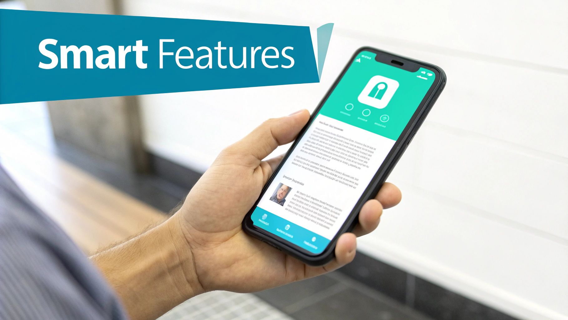
Using Smart Features to Create a Better Experience
Okay, once you've nailed down the basic structure, it's time to get into the really interesting part: the smart features. This is where your scholarship form goes from being a simple, static document to a dynamic, helpful tool for your applicants. Getting this right means you’ll collect clean, complete data while making the whole process far less stressful for them.
This shift is more important than ever. With global scholarship funding soaring past $12 billion in 2024, the competition is fierce, but tough application requirements often stop great candidates in their tracks. Modern form builders can generate compliant templates, understand natural language, and only ask for what's missing. This isn't just a minor tweak; it can cut submission time and seriously improve mobile completion rates. For a deeper dive, check out these global scholarship trends.
Handling File Uploads Securely
Nearly every scholarship needs supporting documents—transcripts, essays, letters of recommendation, you name it. A clunky or confusing file upload process is a classic friction point that can make an otherwise qualified applicant give up entirely.
A smart file upload feature helps you sidestep these problems by letting you set clear parameters. You can—and absolutely should—define exactly what you'll accept to prevent headaches for your review team later.
- Specify File Types: Lock it down to common formats like PDF, DOCX, or JPG. This ensures your team can actually open what they receive.
- Set Size Limits: Keep things moving smoothly by capping file sizes at a reasonable limit, like 5MB. This prevents slow uploads and server errors.
- Provide Clear Instructions: Don't make them guess. Put the requirements right next to the upload button so applicants know what to do before they even click.
Implementing Custom Validation Rules
Good, clean data is the foundation of a fair review process. Think of custom validation rules as a friendly bouncer for your form, catching common mistakes in real-time before they become your problem.
This isn't about being restrictive; it's about providing gentle guardrails. For instance, you can set rules to:
- Enforce a GPA Format: Make sure all GPAs are submitted on a 4.0 scale.
- Monitor Essay Word Counts: Keep answers concise by setting minimum or maximum word counts.
- Check for Valid Email Formats: An automatic check for an "@" symbol and a domain can save a lot of follow-up emails.
This kind of instant feedback makes the whole experience feel smoother and ensures the information you collect is accurate from the get-go. If you're looking for more ideas on how to structure different fields, our guide on registration forms examples is a great resource.
Embracing the Conversational Flow
Here’s probably the most powerful change you can make: ditch the wall-of-text form and adopt a conversational, one-question-at-a-time flow. This approach breaks a massive task into tiny, manageable steps, which dramatically reduces applicant fatigue.
Instead of staring down a list of thirty questions, the applicant is guided through a simple conversation. This is a game-changer on mobile devices, where long, scrolling forms are a nightmare to complete.
By turning the application into a guided dialogue, you make it feel less like an administrative chore and more like a supportive interaction. This simple change in presentation can lead to a significant increase in completion rates.
It’s a more human way to collect information. You show one clear question, wait for the answer, and then move on. It respects the applicant's time and attention, and frankly, it just gets better results for everyone involved.
Earning Applicant Trust and Keeping Their Data Safe
Think about what you're asking students to share: social security numbers, family income details, deeply personal essays. That’s a huge leap of faith. In an age where data breaches are front-page news, applicants are more skeptical than ever, and they have every right to be. Creating a secure and trustworthy application process isn't just a box to check; it’s the bedrock of a successful scholarship program that attracts top-tier candidates.

This all starts with being upfront. Students deserve to know exactly how you'll use their information and, more importantly, how you'll protect it. Vague promises won't cut it. You need to provide clear, easy-to-find information that gives them the confidence to hit "submit."
Setting the Stage for Confidence
Long before an applicant types a single word, they’re forming an opinion about your organization. A polished, professional form that clearly displays your branding—your logo, your colors—is the first signal that you're a legitimate organization that takes this process seriously. It's a simple, but powerful, first impression.
But good looks only go so far. Your most powerful tool is clear communication.
- Make Your Privacy Policy Visible: Don't hide your privacy policy in the footer. Link to it right at the top of the form and explain, in simple terms, what you're collecting and why.
- Use Active Consent: Instead of pre-checked boxes, require applicants to actively opt-in and agree to your terms. This shows you respect their agency.
- Provide Real Contact Info: Give them a clear way to reach a real person if they have questions. An email address or phone number shows there’s someone accountable on the other side.
These seemingly small details are about showing respect for the applicant and their privacy. That’s how you build a real foundation of trust.
I’ve seen it time and again: when you handle applicant data with the same care you'd want for your own, you create an experience that feels secure and professional. For a student who’s on the fence, that peace of mind can be the deciding factor.
Putting the Right Technical Safeguards in Place
Of course, looking trustworthy isn’t enough. You have to back it up with solid technical security. For any scholarship application form, modern data encryption is absolutely non-negotiable.
This means all the information you collect must be encrypted, both when it's sitting on a server (at rest) and while it’s being sent from the applicant's browser to your system (in transit). Think of it as putting their application inside a digital armored truck. It’s the only way to shield their personal details from prying eyes and maintain the integrity of their submission.
The good news is that reputable platforms like Formbot handle this for you, building top-tier security into their system from the ground up so you can focus on finding the best candidates.
What Happens After They Click 'Submit'? Streamlining Your Workflow
The moment an applicant hits "submit" isn't the end of their journey—it's the beginning of yours. What you do next is just as important as the form itself. A clunky, manual post-submission process can leave applicants feeling anxious and bury your team under a mountain of administrative work.
The good news is that you can automate nearly everything that comes after. The first, and arguably most critical, step is to send an instant, personalized email confirmation. It’s a small thing, but it provides immediate peace of mind, letting applicants know their hard work and personal documents landed safely.
Put Your Data and Review Process on Autopilot
Let’s be honest: manually downloading submissions, copying and pasting data into spreadsheets, and then forwarding everything to reviewers is a perfect recipe for mistakes and burnout. Instead, you can connect your scholarship form directly to the tools your team already uses every day. This creates a seamless, automated workflow.
- Connect to Your Database: Automatically pipe every submission into a Google Sheet, an Airtable base, or your organization's CRM. This gives you a live, central hub for all applicant data, making it incredibly easy to sort, track, and manage the entire candidate pool.
- Trigger Smart Notifications: Why make your review committee wait? You can set up rules that instantly ping the right people when an application arrives. A new submission for an arts scholarship could trigger a Slack message to the arts review team, for example.
This kind of automation does more than just make your team more efficient; it prevents great applications from getting lost in a cluttered inbox. For those handling a huge volume of submissions, you can even look into advanced techniques like automating data entry with AI to pull key information from uploaded documents.
A well-oiled post-submission system isn't just about organizing data—it's a direct reflection of your organization's professionalism. Prompt confirmations and immediate access to information for your team make the entire process feel more credible and respectful.
Getting the Right Applications to the Right People
If you're running a larger program with different scholarship tracks or multiple review committees, you know how crucial it is to get the right application in front of the right eyes. Sorting this out by hand is slow and full of potential for human error. This is exactly where automated workflows shine.
Using conditional logic, you can build simple "if-then" rules that automatically route applications based on the answers provided in the form.
Imagine this:
- An application from an engineering major? It can go straight to the engineering department's review committee.
- An applicant indicates a high level of financial need? Their form can be automatically flagged and sent to a specialized review team.
- A submission from California? It can be routed to your West Coast regional reviewers.
Setting up these automated pathways makes your review process faster, more organized, and far more equitable. When you’re picking your tool, it's worth taking the time to compare the best online form builders to ensure you get the integration and workflow features you actually need. By taking the manual work out of the post-submission process, you free up your team to focus on the most important task: choosing the most deserving scholars.
Your Top Scholarship Application Form Questions, Answered
Even with a perfectly planned scholarship program, you're bound to run into questions from your team and, more importantly, from your applicants. Getting ahead of these common queries makes the entire process smoother for everyone involved.
Let's walk through some of the questions I hear most often. Answering them clearly from the start builds trust and shows students you’ve thought through the experience from their perspective.
What Fields Are Absolutely Essential for a Scholarship Form?
You have to start with the non-negotiables: the applicant's full name, reliable contact information (email and phone), and their current educational institution. Those are your core building blocks.
From there, you'll want to layer in academic details like their GPA, major, and expected graduation date. Critically, this is also where you ask the specific eligibility questions that make your scholarship unique. Don't forget a secure file upload field for transcripts or letters of recommendation—that's a must-have for most.
The real secret isn't just what you ask, but how you ask it. Use conditional logic to hide questions that don't apply to a particular student. This keeps the form feeling short, personal, and relevant.
How Do I Get More Students to Actually Complete the Form?
Boosting your completion rate comes down to one thing: respecting the student's time and effort. A clunky, confusing form is an abandoned form.
Here are a few tactics that work every time:
- One question at a time. Ditch the long, intimidating page of fields. A conversational, step-by-step approach feels more like a friendly chat and less like paperwork.
- Think mobile-first. The reality is, a huge number of students will be applying from their phones. Your form needs to be flawless on a small screen.
- Show them the way. Use a progress bar so they know exactly where they are in the process. Clear instructions are your best friend.
- Stop errors before they happen. Use real-time validation to flag a typo in an email address or a misformatted phone number instantly, not after they've already hit "submit."
When you make the process feel less like a chore, your completion rates will skyrocket. It's a simple shift that makes a massive difference.
What's the Best Way to Handle Document Uploads?
This is a major friction point, so you have to get it right. Use a secure, drag-and-drop file upload field that is crystal clear about the rules.
State the accepted file formats upfront (e.g., PDF, DOCX only) and set a realistic file size limit, like 10 MB, to avoid frustrating upload failures.
Once a file is successfully uploaded, immediately trigger an automated confirmation email. This simple step is huge for applicants—it gives them peace of mind that their documents are safe, sound, and in your hands.
Ready to build a scholarship application form that students actually enjoy filling out? With Formbot, you can create a conversational, mobile-first experience in minutes. Watch your completion rates climb and find the perfect candidates for your scholarship. Create your first form for free.


