
Forms are the critical handshake between your business and your audience, yet most are a masterclass in user frustration. High abandonment rates, confusing fields, and poor mobile experiences don't just cost you leads and sign-ups; they actively damage brand perception and squander marketing spend. In 2026, the standard for a positive user experience is non-negotiable. Users demand seamless, intuitive, and even enjoyable digital interactions, and a clunky form is often the first point of failure. A poorly designed form signals that you don't value your user's time, pushing them to competitors who do.
This guide moves beyond generic advice to deliver 10 essential, data-backed web form design best practices tailored for modern teams. We will cover the entire form ecosystem, from leveraging conversational interfaces that feel more like a helpful chat to the critical details of smart validation, mobile-first optimization, and transparent privacy communication. The strategies outlined are designed to be immediately actionable for marketing, UX, HR, and customer experience teams.
Instead of just theory, you'll find a strategic roadmap to transform your data collection processes. We'll explore how to build forms that people actually want to complete, boosting conversions, improving data quality, and enhancing the overall user journey. Whether you're optimizing a lead-gen form, a job application, or a customer feedback survey, these principles will help you create high-performing assets that drive meaningful results. Let's dive in and redefine what your web forms can achieve.
1. Conversational & Progressive Single-Question Interface
One of the most impactful web form design best practices is to shift from a static, multi-field document to a dynamic, interactive conversation. The conversational and progressive single-question interface does exactly this. It presents users with just one question at a time, mimicking a natural, chat-like dialogue. This approach, which leverages the principle of progressive disclosure, guides users through the data collection process step-by-step, dramatically reducing the cognitive load and psychological friction often associated with long forms.
Instead of facing a wall of input fields, users engage in a focused, guided interaction. This method feels less like filling out paperwork and more like a helpful conversation, making it ideal for lead generation, customer onboarding, and complex surveys.
Why It Works
This design pattern excels by focusing user attention and building momentum. Companies like Typeform and Drift have popularized this method, proving its effectiveness in boosting engagement. By asking for one piece of information at a time, you make the initial commitment feel small, encouraging users to start. Each completed question provides a sense of progress, motivating them to continue. This one-question flow is particularly effective on mobile devices, where screen space is limited and traditional forms can feel overwhelming.
How to Implement It
- Set Clear Expectations: Use a progress bar or step counter (e.g., "Step 2 of 5") to show users where they are in the process and how much is left. This manages expectations and prevents fatigue.
- Implement Smart Branching: Use conditional logic to ask only relevant questions based on previous answers. If a user says they are not a business owner, don't ask for their company name. This makes the experience feel personalized and efficient.
- Use Reassuring Microcopy: Incorporate conversational, encouraging language. Phrases like "Got it, thanks!" or "Almost done..." acknowledge user effort and maintain a positive tone.
- Acknowledge Progress: Tools like Formbot leverage this by acknowledging each answer before presenting the next question, which reinforces the feeling of a two-way conversation. As detailed in our guide on conversion rate optimization, this interactive feedback loop is key to keeping users engaged. You can learn more about how these techniques boost completion rates on tryformbot.com.
2. Clear Field Labels and Placeholder Text
One of the most foundational web form design best practices is ensuring every field is instantly understandable through clear, persistent labels and well-used placeholder text. Labels act as the primary signpost, telling users exactly what information is required. Placeholder text, when used correctly, serves as a helpful hint or example of the expected format. The key is that the label must always be visible, even after a user starts typing, to prevent confusion and errors.
This approach eliminates ambiguity, making the form completion process faster and more intuitive. Instead of guessing what a field requires, users are given explicit instructions, which builds confidence and reduces the likelihood of abandonment. This clarity is crucial for maintaining momentum and ensuring data accuracy.
Why It Works
Clarity is the bedrock of usability. Research from pioneers like the Nielsen Norman Group consistently shows that visible, top-aligned labels improve scanning, comprehension, and completion speed. When labels disappear on-click (a common mistake when using them as placeholder text), users lose context, especially if they are interrupted or need to review their entries. Forms from organizations like Gov.uk excel by using explicit, accessible labels that remain present, ensuring users always know where they are and what's needed next.
How to Implement It
- Keep Labels Visible and Top-Aligned: Always place labels outside and above the input field. This is the most user-friendly position for both desktop and mobile, as it keeps the label and field in close proximity and prevents layout issues.
- Use Placeholder Text for Hints, Not Labels: Placeholder text should provide an example of the required format (e.g., "DD/MM/YYYY") or a helpful tip. It should never be the only label for a field.
- Transform Labels into Questions in Conversational Forms: For a more engaging experience, rephrase labels as natural questions. Instead of a sterile "Email" label, a conversational form might ask, "What's the best email address to reach you at?"
- Provide Helper Text for Complex Fields: For fields with specific constraints, like a password or a date, add a short, descriptive sentence below the label. For example, "Must be at least 8 characters long."
- Maintain Consistent Terminology: Use the same terms for the same concepts across all your forms. If you use "Company Name" on one form, don't switch to "Organization Name" on another.
3. Smart Field Validation and Error Prevention
A crucial web form design best practices principle is to help users succeed by preventing errors before they happen. Smart field validation does this by providing instant, context-aware feedback as users fill out the form. Instead of waiting for users to click "submit" only to show them a list of errors, this approach validates information in real-time, guiding them toward successful completion and reducing frustration.
This proactive method turns a potential point of friction into a helpful interaction. It not only improves the user experience but also ensures the data you collect is accurate and properly formatted from the start. Well-executed validation feels like a helpful assistant, subtly correcting mistakes and confirming correct entries.
Why It Works
Real-time validation reduces cognitive load by addressing one field at a time, preventing users from having to re-scan the entire form to find and fix mistakes after submission. This immediate feedback loop builds user confidence and momentum. Stripe’s credit card input, for example, formats the number, identifies the card type, and validates the CVC and expiry date live, making a complex and sensitive task feel secure and straightforward. This approach dramatically lowers form abandonment rates and boosts data quality.
How to Implement It
- Validate on Field Exit: Trigger validation checks when a user moves to the next field (onBlur), not while they are typing. The exception is for fixed-format fields like credit card or phone numbers, where real-time formatting is helpful.
- Write Clear, Human-Friendly Error Messages: Avoid generic messages like "Invalid Input." Be specific and constructive. For example, use "Please enter a valid email, like [email protected]."
- Use Positive Reinforcement: Show success states, such as a green checkmark, when a field is filled out correctly. This visual cue reassures users and encourages them to continue.
- Automate Formatting: For inputs like phone numbers or dates, use libraries or scripts to auto-format the data as the user types. This prevents formatting errors and simplifies data entry.
- Leverage Conversational Forms: Advanced conversational forms can intelligently extract and validate information from a user's free-text response, streamlining data collection without rigid field constraints.
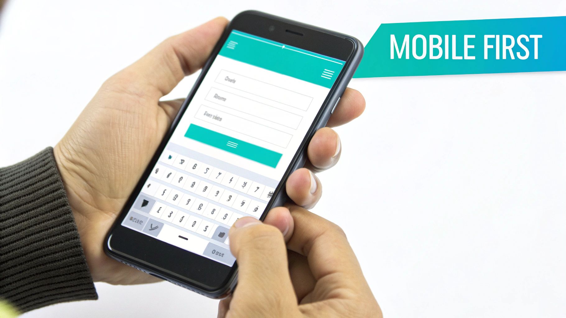
4. Mobile-First Responsive Design
Given that the majority of web traffic now comes from mobile devices, adopting a mobile-first approach is one of the most critical web form design best practices. This strategy involves designing the form experience for the smallest screen first and then scaling up to larger devices like tablets and desktops. It forces you to prioritize essential elements, ensuring a lean, fast, and user-friendly experience on the devices your audience uses most.
Instead of trying to shrink a complex desktop form, you start with a clean, touch-friendly foundation. This ensures that core functionality and usability are perfected for mobile users, who are often less patient and more easily distracted. This approach directly addresses the constraints of small screens, touch-based interaction, and variable network conditions.
Why It Works
A mobile-first design inherently leads to a better user experience across all devices. By focusing on mobile constraints, you eliminate clutter and simplify the user journey. Companies like Airbnb and Venmo excel at this, providing seamless mobile form flows that feel intuitive and effortless. The design principles popularized by Google's Mobile-First Indexing and Apple's Human Interface Guidelines underscore its importance for both usability and search engine visibility. Forms designed this way are faster, more accessible, and achieve higher completion rates because they respect the user's context.
How to Implement It
- Use Single-Column Layouts: On mobile, strictly adhere to a single-column layout. This prevents horizontal scrolling and makes the form easy to follow vertically.
- Implement Large Tap Targets: Ensure all buttons, checkboxes, and input fields have a minimum tap target size of 48x48 pixels. This accommodates imprecise finger taps and reduces frustration.
- Leverage Native Input Types: Use HTML5 input types like
<input type="tel">,<input type="email">, and<input type="date">. This automatically brings up the appropriate keyboard (e.g., a numeric keypad for phone numbers), speeding up data entry. - Test on Real Devices: Browser emulation is helpful, but nothing beats testing on actual iPhones and Android devices. This helps you identify issues with keyboard behavior, viewport rendering, and touch responsiveness that emulators might miss.
5. Smart Required Field Indication and Minimization
A cornerstone of effective web form design best practices is respecting the user's time by minimizing the effort required. This means being strategic about which fields are mandatory and clearly communicating that distinction. Smart required field indication involves auditing every input to determine if it is absolutely essential for the immediate transaction, and then visibly marking only those critical fields.
The goal is to eliminate any non-essential friction. Instead of defaulting to making every field required, this approach challenges you to justify each piece of information you ask for. By minimizing required inputs and clearly labeling the few that remain, you significantly lower the barrier to completion, making the form feel less demanding and more user-friendly.
Why It Works
This method directly addresses a primary cause of form abandonment: user frustration. When faced with a long list of required fields, users often feel overwhelmed or question the necessity of providing so much data. By asking for only what is essential, you streamline the process and build trust. Platforms like Slack and GitHub have mastered this with sign-up forms that ask for as few as three critical pieces of information, proving that a minimalist approach drives higher completion rates.
How to Implement It
- Audit Every Field: For each input, ask: "Is this information absolutely necessary to complete this step?" If not, make it optional or remove it entirely.
- Mark Required, Not Optional: Conventionally, use an asterisk (*) to mark required fields. It's more efficient to mark the few required fields than to label the many optional ones.
- Leverage Progressive Profiling: Ask for the bare minimum upfront (like an email). Once you've established a relationship, you can gather more detailed information later. This is a tactic used effectively by marketing automation platforms like Mailchimp.
- Use Conditional Logic: Implement field dependencies to show or hide fields based on previous answers, ensuring users only see relevant required inputs.
- Incorporate Conversational Data Extraction: Some tools can intelligently process natural language responses to extract necessary data. A user might say, "I need help with billing," and the system can identify the 'topic' field without explicitly asking them to select it from a dropdown. This makes the interaction feel more natural and less like a chore.
6. Intuitive Information Architecture and Form Flow
One of the most foundational web form design best practices is establishing an intuitive information architecture and a logical flow. This means carefully sequencing and grouping fields to create a coherent, predictable, and comfortable user journey. Instead of randomly listing questions, this approach guides the user from simple, low-commitment information to more complex or sensitive data, mirroring a natural conversation.
This logical progression minimizes cognitive friction and decision fatigue. By structuring the form like a story, where each question builds context for the next, you make the entire process feel more rational and less demanding. This is crucial for multi-step processes like event registration, detailed applications, or e-commerce checkouts.
Why It Works
A well-structured form builds trust and momentum. As noted by user experience leaders at the Nielsen Norman Group, ordering questions logically reduces abandonment rates because users don't feel confused or interrogated. It starts with an easy "yes" by asking for simple information first, like a name or email. This small initial investment encourages users to continue, and as they progress, they build a psychological commitment to finishing the form.
This method also respects the user's emotional comfort. Asking for a credit card number or social security number upfront is jarring, but asking for it after establishing context and demonstrating value feels appropriate and secure.
How to Implement It
- Start with Easy Questions: Begin with simple, non-threatening demographic information (e.g., name, email) before moving to more personal or complex requests (e.g., phone number, income).
- Group Related Fields: Use visual separators, headings, or distinct steps to group related information together, such as "Contact Details" and "Billing Information." This makes the form appear more organized and less overwhelming.
- Build Context Sequentially: Order questions to create a logical narrative. For instance, in a booking form like Airbnb's, ask for the destination before asking for available dates, and ask for dates before asking for the number of guests.
- Use Conditional Branching: Create personalized paths that adapt to user input. If a user selects "Individual" instead of "Business," the form should automatically skip questions about company size and industry, making the experience shorter and more relevant.
- Test Your Flow: Use user testing or card sorting exercises to validate your information architecture. Observe where users hesitate or get confused to identify and fix flaws in your form's logical progression.
7. Fast Load Times and Performance Optimization
Even the most thoughtfully designed form will fail if it doesn't load quickly. One of the most critical, yet often overlooked, web form design best practices is ensuring your form is optimized for performance. In an era of shrinking attention spans, even a one-second delay can cause a significant drop in conversion rates. Slow-loading forms lead to user frustration and immediate abandonment, undoing all your hard work on UX and design.
Prioritizing performance means your form appears and becomes interactive almost instantly, regardless of the user's device or network speed. This creates a seamless, professional first impression and encourages users to begin filling out the form. For forms to load quickly and keep users engaged, it's vital to implement crucial website performance optimization techniques that minimize wait times and reduce friction from the very first moment.
Why It Works
Performance is a foundational element of user experience. Fast load times directly correlate with higher engagement and completion rates because they respect the user's time. A user who doesn’t have to wait is less likely to get distracted or reconsider their decision to engage. Companies like Stripe have set a high bar, with checkout experiences that load in under 500 milliseconds, proving that speed is a competitive advantage. Similarly, platforms like Formbot are built with a lightweight architecture to ensure forms are deployed and loaded swiftly, preventing performance bottlenecks from hurting conversions.
How to Implement It
- Measure and Monitor: Use tools like Google Lighthouse and WebPageTest to audit your form's performance. Aim for a First Contentful Paint (FCP) under 1.8 seconds and a Largest Contentful Paint (LCP) under 2.5 seconds.
- Minimize Code Bloat: Trim unnecessary CSS and JavaScript. Use code splitting to only load the scripts needed for the visible part of the form, and lazy-load elements that appear below the fold.
- Audit Third-Party Scripts: Every analytics tool, chatbot widget, or tracking pixel adds to your load time. Critically evaluate each script's necessity and remove any that don't provide essential value.
- Leverage Caching and CDNs: Use a Content Delivery Network (CDN) to serve form assets from a location closer to the user. Implement aggressive caching strategies with service workers to store form components on the user's device for near-instant repeat loads.
8. Clear Call-to-Action and Submission Buttons
The submission button is the final, crucial step in any form interaction. One of the most fundamental web form design best practices is to ensure this call-to-action (CTA) is unambiguous, visually prominent, and reassuring. It must clearly communicate what will happen next, eliminating any hesitation or confusion for the user. A well-designed button acts as a confident final instruction, guiding the user to complete the desired action.
Instead of a generic or poorly styled button that blends into the background, the primary action button should stand out. It needs to use clear, action-oriented language and provide immediate feedback, transforming the submission from a point of friction into a satisfying conclusion of the task.

Why It Works
A clear CTA button improves usability and boosts conversion rates by removing ambiguity. It answers the user's final question: "What happens when I click this?" Companies like Stripe and Slack excel at this, using high-contrast, descriptive buttons like 'Pay' or 'Create account' that leave no room for doubt. This practice, advocated by usability experts at Nielsen Norman Group and codified in Google's Material Design, reduces cognitive load and provides a clear path to completion, reassuring users that their effort will not be wasted.
How to Implement It
- Use Action-Oriented Language: The button's text should describe the specific action the user is taking. Use verbs like 'Create My Account', 'Get Your Free Quote', or 'Join the Waitlist' instead of vague terms like 'Submit' or 'Go'.
- Ensure Visual Prominence: Make the primary CTA button stand out with a contrasting color, sufficient size (at least 44x44px for touch targets), and strategic placement. It should be the most visually dominant element in the form.
- Provide Clear State Feedback: The button must visually react to user interaction. Implement distinct states for default, hover, disabled (e.g., while required fields are empty), and loading (using a spinner) to communicate its status clearly.
- Maintain Conversational Context: In a conversational interface like Formbot, the button should match the chat metaphor. Using a 'Send' icon or a message-like button maintains the feeling of a natural dialogue rather than a transactional form submission.
9. Privacy, Security, and Trust Communication
One of the most crucial web form design best practices is to proactively and clearly communicate your commitment to user privacy and data security. In an era of heightened data sensitivity, users are more hesitant than ever to share personal information. By embedding trust signals and transparent policies directly into your form experience, you can alleviate these concerns, reduce abandonment, and significantly boost submission rates.
This involves more than just a link to a privacy policy in the footer. It's about integrating clear, concise statements about data protection, compliance with regulations like GDPR and CCPA, and security measures like encryption. This approach reassures users at the exact moment they might feel vulnerable, making them more confident in proceeding.
Why It Works
Trust is the bedrock of digital interaction. When users see visible security indicators and clear privacy statements, it reduces their perceived risk. Highlighting measures like SSL encryption or compliance standards acts as a powerful psychological nudge, assuring users that their data will be handled responsibly. Companies like Stripe and GitHub excel at this, building user confidence through transparent security pages and clear data handling policies. When users feel safe, they are far more likely to complete the form, especially when it requests sensitive information.
How to Implement It
- Display Trust Signals Prominently: Ensure your form is served over HTTPS and use security badges (e.g., SSL certificates, TRUSTe seals) near sensitive fields or the submission button.
- Use Clear Microcopy: Add a brief, reassuring statement directly below the email field or near the submit button, such as "We respect your privacy and will never share your information."
- Be Transparent About Data Use: Clearly state how the collected information will be used. For example, "We'll use your email to send you the requested guide and occasional product updates."
- Explain Security for Sensitive Data: When collecting financial or health information, explicitly mention security measures. A simple line like, "Your payment details are encrypted and processed securely," can make a huge difference. For industries with strict regulations, ensuring your forms are compliant is non-negotiable. You can learn more about creating HIPAA-compliant online forms.
- Provide Accessible Policies: To ensure forms are trustworthy, carefully address privacy considerations in your design and link to your full privacy policy. Make it easily accessible, not hidden in fine print.
10. Real-Time Analytics and Form Performance Monitoring
Designing a high-performing web form doesn't end at launch; it begins. One of the most critical web form design best practices is implementing real-time analytics and continuous performance monitoring. This approach transforms form optimization from a guessing game into a data-driven science. By tracking user interactions in real time, you can pinpoint exactly where friction occurs, why users abandon the process, and what changes will have the most significant impact on completion rates.
Instead of waiting for quarterly reports, real-time analytics provide immediate feedback on form health. This allows marketing, UX, and product teams to diagnose issues as they happen, such as a broken field or a confusing question, and deploy fixes before they cause a significant drop in conversions. It’s about creating a continuous feedback loop that powers iterative improvement.
Why It Works
This data-centric methodology is effective because it removes assumptions and replaces them with empirical evidence. Tools like Google Analytics, Hotjar, and Formbot’s built-in analytics dashboard provide a clear view into key metrics like completion rates, field-level drop-off, and average time to complete. Seeing which specific field causes the most hesitation or errors allows you to address the root cause of user frustration, leading to more effective and user-friendly forms.
By monitoring these metrics, you can directly correlate design changes to performance outcomes. For example, A/B testing a new label or question order and seeing an immediate lift in completions provides undeniable validation for your design choices. This continuous, data-informed optimization is the key to maximizing form conversions and gathering higher-quality data.
How to Implement It
- Track Key Performance Metrics: Focus on completion rate (submissions vs. starts), abandonment rate (where users drop off), and time-on-form. These core metrics give you a high-level view of your form's health.
- Segment Your Data: Analyze form performance by device type, traffic source, and user demographics. A form might perform well on desktop but fail on mobile, an insight only segmentation can reveal.
- Use Funnel Analysis: Set up a step-by-step funnel to identify the exact point of user drop-off. If 40% of users leave at the "Phone Number" field, that's your starting point for optimization.
- Monitor Field-Level Errors: Track how often validation errors are triggered for each field. A high error rate on a specific field indicates its label, placeholder text, or required format is unclear. You can learn more about how to measure user sentiment and feedback effectively on tryformbot.com.
- Leverage Heatmaps and Session Replays: Use tools like Hotjar or Crazy Egg to visually understand user behavior. Heatmaps show where users click and move their mouse, while session replays let you watch actual user sessions to see their struggles firsthand.
Top 10 Web Form Design Practices Comparison
| Item | 🔄 Implementation Complexity | ⚡ Resource Requirements | ⭐📊 Expected Outcomes | 💡 Ideal Use Cases | ⭐ Key Advantages |
|---|---|---|---|---|---|
| Conversational & Progressive Single-Question Interface | High — NLU, dynamic branching, many API calls | Medium–High — engineering, NLU models, testing | ⭐📊 Up to 2.5× higher completion; lower cognitive load | Mobile onboarding, lead capture, conversational surveys | Engaging chat-like UX, immediate validation, context-aware questions |
| Clear Field Labels and Placeholder Text | Low — copy + small UX changes | Low — copywriting, accessibility QA | ⭐📊 Fewer errors, faster completion and better accessibility | Any form; fields needing clarity or accessibility compliance | Reduces errors, improves screen-reader support, consistent terminology |
| Smart Field Validation and Error Prevention | Medium — client/server rules, formatting libraries | Medium — dev time, validation libraries, testing | ⭐📊 15–25% fewer submission errors; faster submissions | Payments, signups, high-data-quality forms | Real-time guidance, auto-formatting, better data quality |
| Mobile-First Responsive Design | Medium — responsive layouts, device testing | Medium — device testing, native input tuning | ⭐📊 60–80% of submissions on mobile; improved perceived speed | Mobile-heavy traffic, apps, progressive forms | Better touch UX, reduced misclicks, SEO and mobile performance gains |
| Smart Required Field Indication and Minimization | Medium — field audit + conditional logic | Low–Medium — analytics, conditional implementation | ⭐📊 +5–10% completion per field removed | Lead gen, signup flows, progressive profiling | Lower abandonment, clearer expectations, faster completion |
| Intuitive Information Architecture and Form Flow | Medium–High — UX research, mapping, branching | Medium — user research, testing, maintenance | ⭐📊 Reduces cognitive load (~30%); higher completion | Complex multi-step forms, sensitive or multi-topic flows | Logical sequencing, reduced decision fatigue, personalized paths |
| Fast Load Times and Performance Optimization | Medium–High — front-end + infra optimizations | Medium — performance tooling, CDN, monitoring | ⭐📊 1% conversion loss per 100ms delay; lower abandonment | High-traffic, global audience, slow-network environments | Faster load/submission, better SEO, lower infrastructure cost |
| Clear Call-to-Action and Submission Buttons | Low — design + copy | Low — design QA, accessibility checks | ⭐📊 +5–20% conversion uplift with clear CTAs | Checkout, signup, forms needing explicit next step | Reduces confusion, prevents duplicate submits, accessible sizing |
| Privacy, Security, and Trust Communication | Medium–High — compliance, policy, infra | High — legal review, security controls, audits | ⭐📊 +10–35% conversion lift depending on data sensitivity | Payment, healthcare, any PII collection | Builds trust, ensures legal compliance, reduces hesitation |
| Real-Time Analytics and Form Performance Monitoring | Medium — instrumentation, dashboards | Medium–High — analytics tools, analyst time | ⭐📊 Reveals ~75% optimization opportunities; enables A/B testing | CRO programs, enterprise forms, continuous improvement | Field-level insights, funnel tracking, data-driven optimizations |
From Frustration to Conversation: Start Building Better Forms Today
The journey through the intricate world of web form design best practices reveals a fundamental truth: a form is not merely a data collection tool; it is a critical touchpoint in the user experience. The era of static, intimidating grids of empty boxes is definitively over. In 2026, the baseline for success is no longer just about function, but about creating a seamless, intuitive, and respectful dialogue with your audience. The ten core principles we've explored are the building blocks of that dialogue.
Moving from a frustrating experience to a fruitful conversation requires a significant shift in perspective. Instead of viewing a form as a final hurdle a user must clear, we must see it as a guided interaction, an opportunity to assist and engage. This means abandoning the "one-size-fits-all" mentality and embracing a more dynamic, user-centric approach that anticipates needs and proactively removes friction.
Key Takeaways for Immediate Action
To truly transform your forms, focus on these pivotal concepts:
- Embrace Conversational Design: The most impactful change you can make is moving away from traditional layouts. By presenting one question at a time or using a chat-like interface, you dramatically lower cognitive load, making the process feel less like an interrogation and more like a helpful conversation. This single change addresses issues of flow, mobile usability, and user anxiety simultaneously.
- Prioritize Clarity and Prevention: Your goal is to guide users to success, not catch them in mistakes. This means using crystal-clear labels, providing helpful microcopy, and implementing smart, real-time validation. An error message should be a rare exception, not a standard part of the user journey.
- Build Trust at Every Step: Users are more cautious than ever about their data. Communicating your commitment to privacy and security isn't just a legal requirement; it's a conversion driver. Explicitly state how data will be used, display trust signals prominently, and ensure every interaction feels secure and professional.
Your Roadmap to High-Performing Forms
Mastering these web form design best practices is not an overnight task, but a process of continuous improvement. The immediate next step is to audit your most critical forms. Put yourself in your users' shoes and ask the hard questions: Is this form intuitive on a mobile device? Is every field absolutely necessary? Does the submission button inspire confidence?
Use this audit to create a prioritized action plan. Start with the highest-impact, lowest-effort changes, like clarifying your CTA button copy or simplifying field labels. Then, move on to more significant overhauls, such as redesigning the information architecture or implementing a progressive, multi-step flow for longer forms.
Ultimately, the value of optimizing your forms extends far beyond a simple uptick in completion rates. It directly impacts customer satisfaction, brand perception, and the quality of the data you collect. A well-designed form tells your users that you value their time, respect their privacy, and are committed to providing a superior experience. It's an investment that pays dividends across marketing, sales, product, and support, fueling business growth by turning a point of friction into a moment of connection. Stop losing valuable leads, insightful feedback, and qualified applicants to outdated design. The tools and knowledge are at your disposal; it's time to start building better.
Ready to transform your static forms into engaging conversational experiences? Formbot makes it easy to implement these best practices without writing a single line of code. Build interactive, one-question-at-a-time forms, leverage AI-powered templates, and get the data you need by visiting Formbot to start your free plan today.