A lead capture form isn't just a box on your website. Think of it as your digital handshake—the moment an anonymous browser becomes a genuine business prospect. It's the primary way you gather contact details, like an email or phone number, usually by offering something valuable in return.
Why Your Lead Capture Form Is Your Most Important Handshake
Imagine your website is a real, brick-and-mortar shop. A visitor walks in. That first interaction is everything, right? Your lead capture form serves the exact same purpose online. It can be a welcoming guide that pulls people in or a frustrating barrier that sends them running for the exit.
The biggest mistake I see businesses make is creating forms that are, frankly, a pain to fill out. A clunky, confusing, or nosy form is the digital version of a bored, unhelpful store clerk. It creates friction. And when users hit friction, they leave. This means you're losing potential customers without even realizing it, creating a leaky sales funnel right at the top.
The Shift from Data Collection to Conversation
The role of a lead capture form has changed dramatically. We're well past the days of it being a simple data entry tool. Today, it’s the very first step in building a customer relationship, and that initial interaction sets the tone for everything that follows.
A truly great form does a few key things all at once:
- It starts a relationship. By asking for information in a way that feels natural and respectful, you start building trust from the very first click.
- It qualifies interest. Someone willing to fill out a form is showing a much higher level of intent than someone who just browses a page.
- It powers your entire growth engine. The information you collect fuels everything from email campaigns to sales calls.
The real goal isn't just to snag an email address. It's to kick off a meaningful conversation that helps a prospect move smoothly from being curious to becoming a happy customer. Getting this one touchpoint right is one of the highest-leverage things you can do for your business.
Turning Traffic into a Thriving Pipeline
Every single person who visits your website is a potential lead. But without a solid way to capture their interest, that potential just evaporates. A well-crafted lead capture form is the essential bridge between anonymous traffic and a predictable, healthy sales pipeline. It’s how you turn passive browsing into actionable leads.
To get the most out of your forms, it helps to really understand the bigger picture of Leads in Marketing, from scoring and qualifying them to ultimately converting them. This knowledge transforms your form from a simple contact collector into a strategic tool that directly drives revenue and builds strong customer relationships from that very first handshake.
From Static Fields To Smart Conversations
We’ve all seen them: the classic lead capture form. It’s a wall of empty boxes asking for your name, email, company, job title, and who knows what else. While they get the job done sometimes, this "all-or-nothing" approach often feels like an interrogation. It demands everything at once, which can feel intrusive and just plain overwhelming.
This friction isn't just a small annoyance; it's a conversion killer. In the real world, these old-school forms are notorious for high abandonment rates. A shocking 67% of visitors will ditch a form for good if they run into any trouble. On the flip side, businesses that switch to conversational forms—which ask questions one at a time—see conversion rates jump by as much as 30%.
The Rise of Smarter Form Experiences
Smart marketers quickly realized the static form model was broken and started looking for better ways. Early improvements came in the form of multi-step forms and progressive profiling, which wisely broke the process down into smaller, more digestible pieces.
Instead of hitting someone with ten fields right away, a multi-step form might just ask for a name and email first. Once the person commits to that small step, they're much more likely to continue and provide company details on the next screen. It’s all about reducing that initial mental hurdle.
This is where the role of the form starts to shift, moving from a rigid gatekeeper to a helpful concierge.
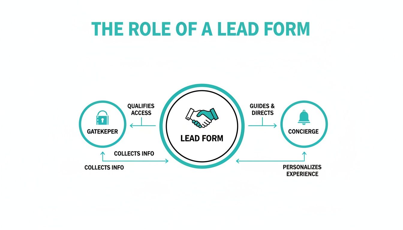
The big idea here is to guide users through a smooth, pleasant exchange instead of just blocking access until they hand over all their data.
The Modern Solution: Conversational Forms
The real game-changer in lead capture is the move to genuinely conversational interactions. These forms ditch the traditional layout altogether for a chat-like interface that presents questions one by one. This simple change turns a boring task into an actual dialogue.
The psychology here is incredibly effective. It's a classic persuasion principle called the "foot-in-the-door" technique. You start with a tiny, easy request, like "What's your first name?" Once someone makes that small commitment, they're far more inclined to answer the next question, and the next.
A conversational lead capture form doesn't feel like a form at all. It feels like a natural, two-way conversation, which is exactly what users—especially on mobile—expect from their digital experiences today.
This design drastically lowers the cognitive load. Instead of scanning a dozen fields and deciding where to start, the user just has to focus on one simple question at a time. This guided, step-by-step flow feels less demanding and more personal, leading to much better completion rates.
How AI Elevates the Conversation
Tools like Formbot are pushing this idea even further by weaving AI into the conversation. The platform can generate a complete, interactive form from just a simple text prompt, making it fast to build and launch. You can dive deeper into what conversational design is and its core principles in our detailed article.
This technology makes data collection dynamic. The form can understand natural language, pull key details from a user's typed response, and smartly skip questions it already has answers for. It creates a friendly, efficient interaction that feels less like paperwork and more like texting a helpful assistant—a clear advantage for any business serious about boosting conversions in 2026.
Designing a Form People Actually Want To Complete

The real difference between a lead capture form that works and one that just sits there is simple: it respects the user's time and attention. A great form feels less like a chore and more like the next logical step on a helpful journey. Getting this right is a delicate balance of psychology, sharp copywriting, and smart visual design.
Think of it this way: every single field you add is a small price the user has to pay. They're paying with their time and their personal information. Your job is to make it crystal clear that what you're offering in return—the ebook, the demo, the newsletter—is absolutely worth that price.
The Golden Rule: Less Is More
If you only make one change to your lead capture form, make it this: remove every unnecessary field. Each extra question you ask adds friction and gives someone another reason to walk away. It’s no surprise that research consistently shows 68% of people will abandon a form if it's too long or confusing.
The goal isn't to get every possible data point on the first go. It's to open a door. Start with the absolute minimum you need to kick off a relationship, which is usually just a name and an email.
A B2B company I know cut their demo request form from ten fields down to just four essentials: name, email, company, and role. The result? A 35% jump in submissions. Every single field has to earn its keep.
You can always gather more information down the line with things like progressive profiling or in your follow-up conversations. The only job of this initial form is to capture the lead. Period.
Writing Microcopy That Guides and Persuades
The small bits of text on your form—the labels, the placeholder text, the button copy—are all part of what we call microcopy. Don't underestimate them. This text has a huge impact on whether someone actually finishes the form. Your words need to be clear, concise, and reassuring.
Here’s how to put your microcopy to work:
- Use Obvious Labels: This isn't the place to get clever. "First Name" works far better than "What should we call you?" When it comes to forms, clarity always trumps creativity.
- Provide Helpful Placeholders: Use placeholder text to show an example of the format you need (e.g., "[email protected]"). Just be careful not to use it as a replacement for the label itself, as it can disappear and confuse users.
- Write a Compelling CTA: The text on your submission button is your last chance to make your case. "Submit" is boring and uninspiring. Instead, tie the button's action to the value you're providing. Try something like "Get My Free Guide" or "Start My Free Trial." This tiny change reframes the whole interaction from giving something up to getting something valuable.
For a deeper dive into these concepts, our article on form design best practices has you covered.
Creating an Intuitive and Trustworthy Layout
Good visual design isn't about making things pretty—it's about building trust and creating a smooth, frictionless path to completion. A clean, organized layout immediately tells visitors you're professional and makes the form feel way less intimidating.
Let's break down the essential design elements and why they matter for your conversion rates.
Key Form Design Elements and Their Impact on Conversions
| Design Element | Best Practice | Impact on Conversion |
|---|---|---|
| Layout | Use a single-column layout. | A single, clear path from top to bottom reduces cognitive load and keeps users moving forward without confusion. |
| Whitespace | Be generous with spacing around fields. | Reduces visual clutter, making the form feel less dense, more organized, and easier to tackle. |
| Visual Hierarchy | Make the headline and CTA button stand out. | Guides the user’s eye to the most important elements, clarifying the form's purpose and encouraging completion. |
| Branding & Colors | Use your company's logo, fonts, and colors. | Reinforces trust by showing users they are in the right place and that their data is being handled by a legitimate business. |
Getting these visual cues right is a non-negotiable part of building a form that people trust. For some great real-world inspiration, check out these high-converting lead generation form examples.
Mobile-First Design Is No Longer Optional
More than half of all web traffic now comes from mobile devices. If your form isn't designed for a small screen, it's already broken. But true mobile optimization is more than just a "responsive" layout that shrinks to fit a phone. It requires a completely mobile-native mindset.
Let's be honest: traditional forms, even when they're responsive, can be a real pain to use on a phone. Tapping into tiny fields and typing on a cramped keyboard is frustrating. This is exactly where conversational interfaces, like the ones used in chat-based forms, shine.
By asking one question at a time in a familiar, text-message style, conversational forms completely remove the friction of mobile data entry. The entire experience feels natural and guided, which leads to dramatically higher completion rates on smartphones—a critical edge you'll need to have in 2026.
Advanced Strategies To Boost Form Conversion Rates
Just having a well-designed lead capture form is a great starting point, but the real magic happens when you commit to continuous, intelligent optimization. Moving from "good enough" to "great" isn't about guesswork; it's about a strategic approach that blends rigorous testing, smart placement, and a bit of human psychology. This is what turns a simple form from a data collector into a reliable conversion machine.
The bedrock of any advanced strategy is a commitment to making decisions with data. Instead of assuming you know what works, you have to test every critical element of your form to discover what truly clicks with your audience. This isn't about finding a single "perfect" formula, but about creating a cycle of constant improvement.
Unlocking Your Winning Formula with A/B Testing
A/B testing, often called split testing, is simply comparing two versions of your form to see which one performs better. By changing just one thing at a time—like the headline, a button color, or a form field—you can pinpoint exactly what encourages more people to hit "submit." This methodical approach takes the guesswork out of the equation and lets you build a high-converting form based on actual user behavior.
So, where do you start? Begin by testing the most impactful parts of your form:
- Headlines: Try pitting a benefit-driven headline (e.g., "Get Your Free Marketing Plan") against a more direct one (e.g., "Download Our Ebook"). Your headline is the first thing people see, and its clarity can make or break their decision to continue.
- Call-to-Action (CTA) Button: The text on your submission button is surprisingly powerful. Test an action-oriented phrase like "Start My Free Trial" against something more passive like "Submit." Don't forget the color and size of the button, either—they play a huge role in grabbing attention.
- Form Length and Question Order: Experiment with the number of fields. You could run a test comparing a three-field form against a five-field version. You might discover, as many have, that a shorter form can significantly increase conversions. Also, play with the order of your questions. Asking for an email before a phone number, for instance, often feels less intrusive and gets better results.
Strategic Placement for Maximum Visibility
Where you put your form is just as important as what's on it. You need to place it in high-intent spots where visitors are already looking for answers or are most receptive to your offer. Just sticking it on a generic contact page and hoping for the best is a huge missed opportunity.
Consider these high-impact placements:
- Dedicated Landing Pages: For any specific marketing campaign, a dedicated landing page is your best friend. With a single focus and a prominent lead capture form, it eliminates all other distractions.
- In-Line with Content: Placing a form directly within a relevant blog post or guide catches people at the peak of their interest. They're already engaged with the topic, making them far more likely to convert.
- Exit-Intent Pop-Ups: These pop-ups appear right when a user’s cursor moves to leave your site. It’s one last chance to grab their attention with a compelling offer, like a quick discount or a free resource.
The key is to match the form’s placement and offer to the user’s mindset at that specific point in their journey. A well-timed form feels helpful, not intrusive.
Building Unshakable Trust with Social Proof
When you ask for personal information, people naturally hesitate. You can ease that anxiety by adding powerful trust signals right next to your form. These elements give you third-party validation and reassure visitors that they're making a good, safe choice.
In fact, forms that include trust signals often see conversion rates jump. Some of the most effective signals are:
- Testimonials: A short, punchy quote from a happy customer can be incredibly persuasive.
- Social Proof: Displaying logos of clients you've worked with or showing how many people have already signed up (e.g., "Join 15,000+ subscribers") builds immediate confidence.
- Privacy Assurances: A simple line like, "We respect your privacy and will never share your information," can work wonders to reduce friction.
By systematically testing, placing, and building trust, you can fine-tune your lead capture form into a highly efficient engine for growth. For more actionable ideas, you might be interested in our guide on conversion rate optimization tips for 2026. This process of continuous improvement is what ensures you’re always getting the most out of your lead generation efforts.
How to Measure Your Form's Performance
Creating a sharp-looking lead capture form is a great start, but it's only half the job. To figure out what’s actually working—and what's not—you have to get past gut feelings and dig into the data. Measuring your form's performance is like giving it a report card; it shows you exactly where you're acing the test and where you need to study up.
This is how you stop guessing and start making smart, informed changes. By keeping an eye on just a few key numbers, you can turn a simple data-entry box into a powerful engine for generating genuinely qualified leads.
Key Metrics You Must Track
You don't need a massive, complicated dashboard to get a clear picture of your form's health. Just focus on these four essential metrics. Together, they tell the full story of how people interact with your form, from the moment they land on it to the second they hit "submit."
- Submission Rate: What percentage of people who see your form actually start filling it out? A low submission rate might mean your form is in the wrong place or the offer just isn't compelling enough.
- Conversion Rate: This is your north star, the ultimate measure of success. It’s the percentage of visitors who successfully complete and submit the form. This one metric tells you how well your form is doing its core job.
- Abandonment Rate: This is the flip side of your conversion rate. It tracks how many users start the process but bail before finishing. High abandonment is a huge red flag, often pointing to friction points like a confusing question or just too many fields.
- Time-to-Complete: How long does it take the average user to get through your form? If it's taking ages, that's a clear signal that your form is too complex or demanding, which will almost certainly drag down your conversion rate.
What Is a Good Conversion Rate?
Knowing your numbers is one thing, but you need context. How do your stats stack up against others in your industry? Benchmarking helps you set realistic goals and understand if you're truly on the right track.
Tracking and improving your form's performance is one of the most important best practices. It's what separates the amateurs from the pros and ensures your efforts are actually driving business results.
So, what should you aim for? Real-world benchmarks show average form conversion rates hovering around 2-5% for cold traffic. For warmer audiences who already know you, that can jump to 10-25%. As these lead generation form insights show, optimized conversational designs often push those numbers toward the higher end of the spectrum. A "good" rate really depends on who you're talking to and what you're offering.
Setting Up Your Tracking System
The good news? You don’t need to be a data scientist to monitor all this. Most modern tools make it incredibly simple. You can use a dedicated analytics platform like Google Analytics or just rely on the built-in dashboards that come with your form builder.
For example, a platform like Formbot gives you real-time analytics right in your dashboard, letting you see views, submissions, and conversion rates at a glance. This immediate feedback is what makes continuous improvement possible. You can pinpoint exactly where users are dropping off, make targeted adjustments, and watch your numbers climb—setting you up for success in 2026 and beyond.
Building Trust Through Privacy and Transparency

In an era where everyone is skeptical about their data, trust isn't just a bonus—it’s your most valuable currency. A good lead capture form has to do more than just collect information. It needs to earn a user's confidence by being completely transparent about how their data will be handled. This isn't just about avoiding legal trouble; it's a powerful way to boost conversions.
Being upfront and respectful from the very first click lays the foundation for a much stronger, long-term customer relationship. People are simply far more willing to share their details with a business that clearly respects their privacy.
Your Privacy Checklist for Every Form
To bake this trust directly into your forms, you have to tackle privacy head-on. That means complying with major regulations like GDPR and CCPA, which have really set the global standard for data protection. The good news is that the best practices for compliance also happen to be fantastic for building user confidence.
Here are the non-negotiables every form should have in 2026:
- A Clear Privacy Statement: Put a simple, easy-to-understand sentence right near the submit button. Something as straightforward as, "We value your privacy and will never share your information," can do wonders to reduce hesitation.
- Explicit Consent Checkboxes: Never use pre-ticked checkboxes for marketing consent. Users must actively opt-in, giving you a clear "yes" to receive emails or other messages.
- Explain the "Why": Briefly and plainly state what you'll do with their information. For example: "We'll use your email to send the guide you requested and occasional marketing tips." This kind of clarity removes all suspicion.
Being trustworthy isn’t just about avoiding fines. It’s about signaling to potential customers that you are a reputable business that puts them first. This simple act of respect can dramatically improve form completion rates and the quality of leads you generate.
By making privacy a core feature of your lead capture strategy, you turn a simple transaction into the beginning of a relationship. You're proving that you value the person just as much as the data they're giving you.
Answering Your Top Questions About Lead Capture Forms
As you start dialing in your lead capture strategy, you'll inevitably run into a few common questions. We hear them all the time. Getting these right can be the difference between a form that just sits there and one that actually pulls in quality leads. Let's break down the big ones.
How Many Fields Is Too Many?
Ah, the million-dollar question. The honest answer is: as few as you can get away with, but as many as you truly need. It’s all a balancing act. You need enough data to qualify and contact the lead, but every extra field you add creates a little more friction for the user.
Think of it like a value exchange. For a simple newsletter signup, asking for more than a name and email feels like overkill. But for a high-stakes offer, like a custom quote or a free software demo, people expect to provide more detail. They understand you need information like their company name, role, and specific challenges to give them something valuable in return.
This is where conversational forms, like the ones you can build with Formbot, really shine. They collect information one piece at a time, making the whole process feel less like filling out tax paperwork and more like a friendly chat. This simple shift in psychology can dramatically boost completion rates, even when you need to ask for more info.
Where’s the Best Place to Put a Form?
Placement is everything. You can have the most beautifully designed form in the world, but if it’s buried where no one sees it, it’s not going to do you any good. The key is to place your lead capture form where your visitors are most engaged and ready to take the next step.
Here are a few proven, high-impact spots to consider:
- Homepage Hero Section: This is prime real estate. It's the first thing many visitors see, making it perfect for capturing broad interest right away.
- Dedicated Landing Pages: When you're running a campaign for a specific offer, a focused landing page with a single call-to-action is your best bet. No distractions, just a clear path to conversion.
- End of Blog Posts: Someone just read 1,500 words of your expert advice. They’re engaged and likely see you as a trusted authority. This is the perfect moment to offer them a related resource or a newsletter subscription.
- Exit-Intent Pop-ups: Just before a visitor clicks away, an exit-intent pop-up gives you one last shot to grab their attention with a compelling offer.
The goal is to make the form feel like a natural next step in their journey, not an annoying interruption.
What's the Real Difference: Conversational vs. Multi-Step Forms?
This one comes up a lot. Both are definitely a step up from those old-school, single-page forms that look like a wall of text. But they provide very different user experiences.
A multi-step form simply breaks a long, traditional form into smaller, digestible chunks or pages. It can make the form feel less intimidating at the start, but at its core, it’s still just a questionnaire the user has to click through.
A conversational form, however, completely changes the dynamic. It creates an actual two-way dialogue in a chat-like interface. Instead of just filling in boxes, the user is guided through a series of questions in a way that feels natural and personal. It’s an interactive back-and-forth, which is a much more modern and intuitive experience—especially on mobile, where this will be the standard by 2026.
Ready to stop collecting data and start having conversations? With Formbot, you can use AI to build engaging, high-converting forms in just a few seconds. Start for free and see what a difference a real conversation can make.


