Your order form is the final handshake in your sales process, but for most businesses, it’s a weak one. If you're still using a static, old-school form, you're likely leaving a surprising amount of money on the table. It’s not just a data collection tool; it’s the make-or-break moment where a curious visitor becomes a paying customer—or walks away for good.
A clunky, confusing form creates friction, and friction kills conversions. It’s a silent leak in your revenue stream.
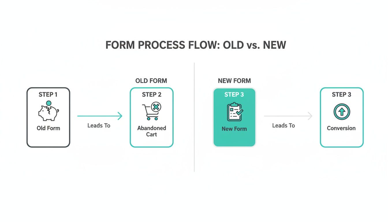
Why Your Current Order Form Is Sabotaging Your Sales
Let's get straight to the point: that standard order form is probably costing you more than you realize. Every extra field, every confusing instruction, and every second a customer wastes trying to check out is another reason for them to abandon their purchase.
The numbers don't lie. The average cart abandonment rate hovers around a staggering 69.8% across e-commerce. This isn't just a minor issue; it’s projected to cost businesses over $18 billion in lost sales in 2026 alone. Learning how to reduce checkout abandonment by refining this final step is one of the most impactful changes you can make.
What's So Bad About Traditional Forms?
Traditional forms are often the single biggest bottleneck in the customer journey. They hit users with a wall of empty boxes that feels overwhelming, especially on a phone.
The core issues usually boil down to a few key things:
- Too Many Fields: Asking for a life story upfront is a surefire way to scare people off.
- Awful on Mobile: Pinching and zooming to fill out a desktop-era form is a terrible experience.
- No Real-Time Help: They don't guide users or help them fix errors as they happen, leading to frustration.
A bad form feels like an interrogation. A good one feels like a conversation. Your goal should be to guide the user across the finish line, not just demand their data.
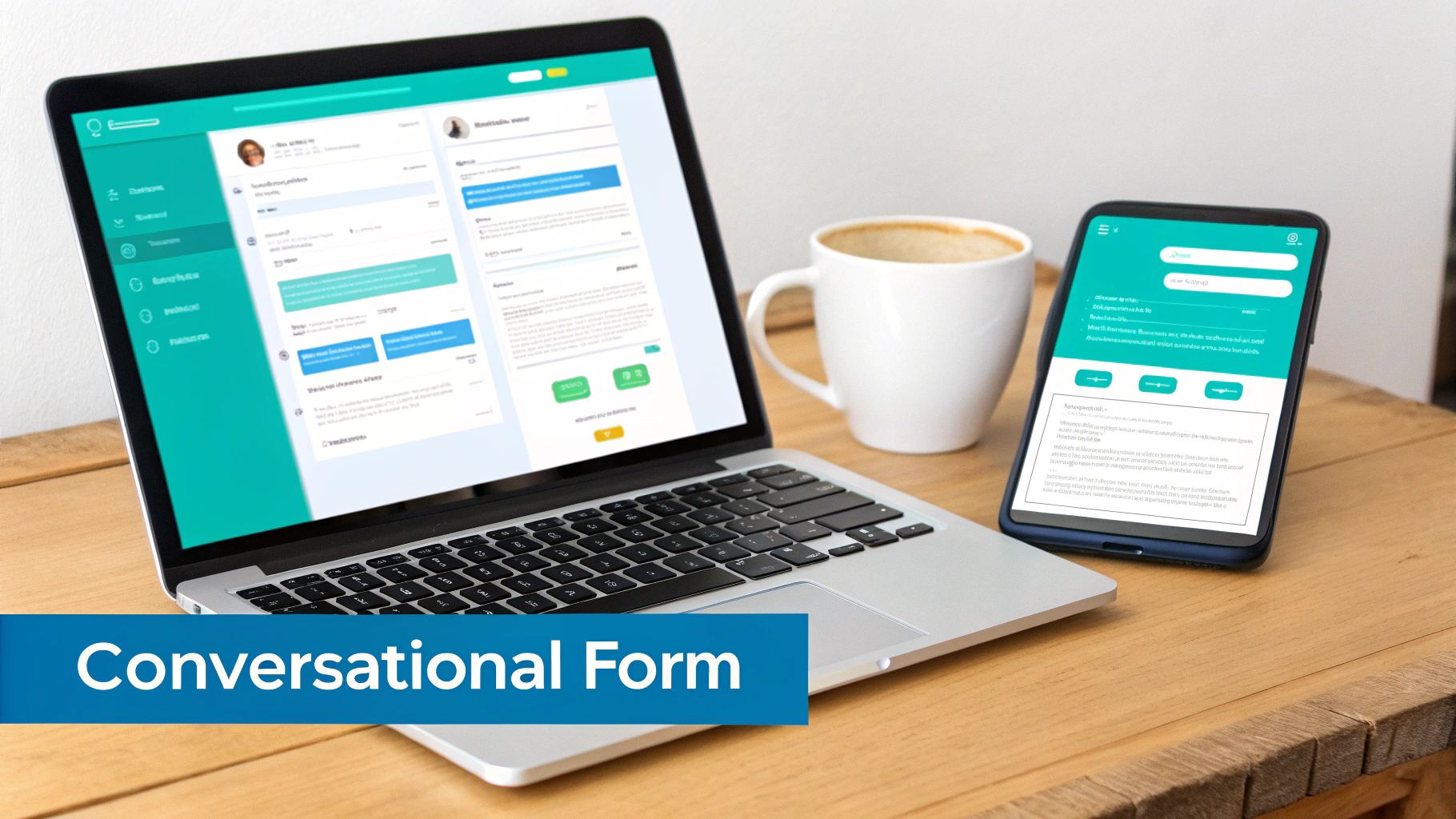
Making the Switch to a Conversational Flow
This is where a fresh approach can completely turn things around. Instead of a rigid list of questions, conversational forms engage users one step at a time, just like a natural chat. It feels less like paperwork and more like a helpful assistant guiding them through the process.
This Formbot shows just how different the experience can feel:
Presenting just one question at a time dramatically lowers the mental effort required from the user. It makes the entire process feel quicker and less intimidating. This simple change in design can have a massive impact on your completion rates, transforming a potential point of frustration into a smooth, positive interaction.
Traditional vs Conversational Order Forms: A Quick Comparison
To see the difference clearly, let's break down how these two approaches stack up side-by-side.
| Feature | Traditional Form | Conversational Form (Formbot) |
|---|---|---|
| User Experience | Static, often overwhelming | Interactive, engaging, one question at a time |
| Mobile Friendliness | Poor; requires pinching and zooming | Excellent; designed for mobile-first interaction |
| Completion Rate | Typically lower | Significantly higher due to reduced friction |
| Guidance | Minimal to none | Real-time validation and contextual help |
| Feel | Impersonal, like filling paperwork | Personal, like a guided conversation |
| Data Collection | All at once, intimidating | Progressive, feels less demanding |
The takeaway is clear: moving to a conversational model isn't just about aesthetics; it’s about fundamentally improving the user experience to drive better business results. It sets the stage for a smoother, more profitable transaction from the very first click.
Blueprint for a High-Converting Order Form
Before you even think about opening a form builder, let's talk strategy. A great order form isn't just a list of questions; it's a guided journey that effortlessly takes a customer from "I want this" to "It's on its way." Skipping this planning stage is the number one reason I see businesses end up with confusing, clunky forms that bleed sales.
The golden rule here is minimalism. Every single field you add is a tiny bit of friction, another reason for someone to second-guess their purchase. So, start by listing the absolute must-haves for processing an order.
Typically, this boils down to four key things:
- Contact Info: Name and email are the bare minimum.
- Product Details: What exactly are they buying? Think size, color, or other variants.
- Shipping Address: Where does it need to go?
- Payment Details: The final step to lock in the sale.
Everything else is up for debate. Do you really need their phone number right now? Is that second address line truly mandatory for every customer? If you're looking for a solid framework, the principles of building high-converting lead capture forms apply perfectly here and can give you a great starting point.
Mapping the Customer's Journey
Put yourself in your customer's shoes. Imagine you're selling t-shirts. The natural flow is to pick a design, then choose a size, and finally select a color. Each step should logically follow the last. You don't want to ask for their shipping address before they've even decided on a size.
This is where so many older forms go wrong, and it’s an expensive mistake.
As you can see, a convoluted process is a direct path to an abandoned cart. A thoughtful, streamlined flow is what turns interest into revenue.
Leveraging Templates for a Head Start
Good news—you don't have to reinvent the wheel. Using a pre-built template for common scenarios like product sales, service bookings, or event registrations can give you a massive head start. You can find templates built around conversion best practices that provide a proven foundation you can customize.
This idea is far from new. Think about it: the U.S. Post Office introduced pre-printed money order forms way back in 1883. By 1920, they had processed over a billion transactions, all thanks to a standardized, efficient system. It was a masterclass in reducing friction long before the internet existed.
Your goal is to make the decision to buy as easy as possible. Your form's design should remove all obstacles, making the path to purchase clear, simple, and quick.
With a solid plan in place, you're ready to build an order form that not only looks professional but actually works, turning more of your visitors into happy, paying customers.
Building Your Form the Smart Way
Alright, with your plan in hand, it's time to actually build this thing. Forget the old days of manually dragging and dropping every single field into place. This is where modern tools really shine, and you can get a powerful, functional order form up and running in minutes, not hours.
The real game-changer is using conversational AI to do the heavy lifting.
Instead of starting from a blank canvas, you can just tell Formbot what you need. A simple prompt like, “Create an order form for custom t-shirts with options for size, color, and a field to upload a logo” is all it takes. The AI instantly generates a solid starting point with all the right fields, letting you jump straight to the fine-tuning.
Dialing in the Details: Fields and Validation
Think of the AI-generated form as your first draft. Now, you get to be the editor. You can easily click into any field to rename it, add helpful placeholder text (like "e.g., [email protected]"), or mark it as required so nobody can skip it.
One of the most important steps here is setting up validation rules. This is your form’s quality control, and it saves you countless headaches down the road. For instance, you can set the email field to accept only valid email formats, which drastically cuts down on typos that would otherwise lead to lost customers. For a phone number, you can require a specific number of digits.
These little rules are lifesavers. They prevent bad data from ever reaching you and give users instant feedback if they make a mistake.
Making It Your Own: Product Options and Layout
This is where you bring your products to life. Let’s stick with that custom t-shirt example. In Formbot, you can take that "Size" field and add your specific options: Small, Medium, Large, XL. For the "Color" field, you could add dropdown choices like "Red," "Blue," and "Green."
Selling art prints? You can add options for different sizes and even set a stock limit for each one. This is crucial for preventing overselling of limited-edition items.
Next, you'll want to pick the right layout. How your form looks and feels has a massive impact on the user experience.
- Chat-Style Layout: This turns the form into an interactive conversation, which is fantastic for mobile users. It feels less like a chore and more like texting with a helpful assistant. It's perfect for simpler orders.
- One-Question-at-a-Time Layout: This approach breaks the form down into bite-sized chunks, showing a single question per screen. It’s a great choice for more complex orders because it minimizes overwhelm and keeps the user focused.
The best layout isn't about what looks coolest—it's about what creates the least friction for your customer. A quick pizza order is a natural fit for a chat-style form. A detailed booking for a design consultation is probably better served by a focused, one-question-at-a-time flow.
Starting with an AI-generated base and then thoughtfully customizing it creates an experience that just works. This isn't just a gimmick; it's a smarter way to guide users through the buying process. If you want to dive deeper, our guide on what is conversational design explains the principles that turn a simple form into a powerful sales tool.
Smart Logic and Secure Payments: Turning a Form into a Sales Engine
An online form is just a set of questions until it can actually handle a transaction. To build an order form that truly drives revenue, you need a payment process that's both seamless for the user and completely trustworthy. This isn't just a technical step; it's the critical moment where you earn a customer's confidence to click "buy."
This is also where the real magic happens. A great order form needs to do more than just list products—it has to think. It should be crunching numbers in real-time, instantly adding up costs, applying the right sales tax, figuring out shipping, and validating discount codes on the fly. When a customer sees their total update live as they make choices, it creates transparency and avoids any nasty surprises at the end.
Make Your Form Smarter with Conditional Logic
Beyond basic math, your form should adapt to what the user is doing. That's the whole idea behind conditional logic—it turns a static, one-size-fits-all questionnaire into a dynamic conversation. Think of it as the "if-then" brain that makes your form feel intuitive.
With conditional logic, you can guide each customer down a path that makes sense for them. For example, you could:
- Offer the right shipping: If a customer selects "Canada" as their country, your form can instantly hide all the US and international shipping options. Simple, clean, and relevant.
- Suggest smart upsells: When someone adds a premium t-shirt to their cart, you could reveal an optional add-on for a matching hat—an offer you wouldn't bother showing for a basic tee.
- Handle custom requests: If a customer ticks a box for "gift wrapping," a new field can appear asking for a personalized message.
This kind of intelligent routing keeps the form clean and prevents you from overwhelming people with questions that don't apply to them. It gets them to the finish line faster.
You Can't Overlook Security
Let’s be honest, in 2026, online security is non-negotiable. Customers are rightfully paranoid about where their credit card information is going, and the slightest hint of an insecure process will send them scrambling for the exit button. Your order form has to scream "your data is safe with me."
The single best way to reduce cart abandonment during checkout is to build undeniable trust. That means using payment providers people recognize, showing off security badges, and making the entire process feel professional and locked down.
This is exactly why Formbot integrates directly with trusted payment gateways like Stripe. By letting established platforms handle the sensitive data, you're not only offloading the heavy compliance work but also borrowing their rock-solid reputation. When someone sees that familiar, secure Stripe interface pop up, their anxiety plummets, and their willingness to complete the purchase goes way up.
By weaving together dynamic calculations, smart conditional logic, and ironclad security, you can transform a simple form into an intelligent sales tool—one that actively helps you convert visitors into paying customers.
Making Your Form Work Flawlessly on Mobile (and Getting It to Your Customers)
Let's be honest: a brilliant order form is completely useless if it falls apart on a smartphone. These days, if you aren't designing for a small screen first, you're already behind. Think about it—if your customers have to pinch, zoom, and painstakingly type everything out on their phones, they're going to give up. This is precisely why a conversational, chat-like form almost always beats a traditional layout on mobile.
It stops feeling like a chore and starts feeling like a simple, guided conversation.
This whole shift to mobile-first thinking isn't just some passing trend. It's a direct reaction to how people actually shop now. Global online sales hit an incredible $6.3 trillion in 2024 and are on track to reach $8.1 trillion by 2026. A massive chunk of that growth? It's coming from people buying stuff on their phones.
Must-Haves for a Killer Mobile Experience
To really connect with the mobile crowd, your form has to be dead simple to use. A clunky, frustrating interface is an immediate deal-breaker.
I’ve found these are the non-negotiables for a smooth mobile experience:
- Big, Tappable Buttons: Make sure any clickable element is large enough for a thumb to hit easily without accidentally tapping something else.
- Keep Typing to a Minimum: Use dropdowns, sliders, or pre-selected options wherever you can. Nobody wants to type out a long shipping address on a tiny keyboard.
- One Thing at a Time: A conversational flow, asking one question at a time, keeps the screen from feeling overwhelming and helps the user focus.
- Show Them the Finish Line: A simple progress bar is a powerful tool. Letting people know they're almost done can dramatically reduce how many people abandon the form.
Embracing this mobile-first mindset is one of the cornerstones of successful e-commerce today. You can get a deeper understanding by reading our guide on what is mobile-first design.
How to Share Your Form and Start Selling
Once your form is polished and works perfectly on any device, you need to make it incredibly easy for customers to find it. The whole point is to remove every single obstacle between their decision to buy and the final click. A good form builder makes this part instant and flexible.
Your sharing strategy should be as frictionless as your form. The moment a customer decides to buy, the path to your order form should be immediate and obvious, no matter where they are.
You’ve got a few great options for getting your form out there:
- Share a Direct Link: This is the easiest way. Just copy the form’s unique URL and paste it anywhere—your social media bio, an email newsletter, or even a text message. It's perfect for a flash sale or a targeted campaign.
- Embed It on Your Website: This is my preferred method for a professional look. You can integrate the form directly into your website or a specific landing page. It keeps the entire checkout process right there on your site, which builds trust and keeps the customer journey seamless.
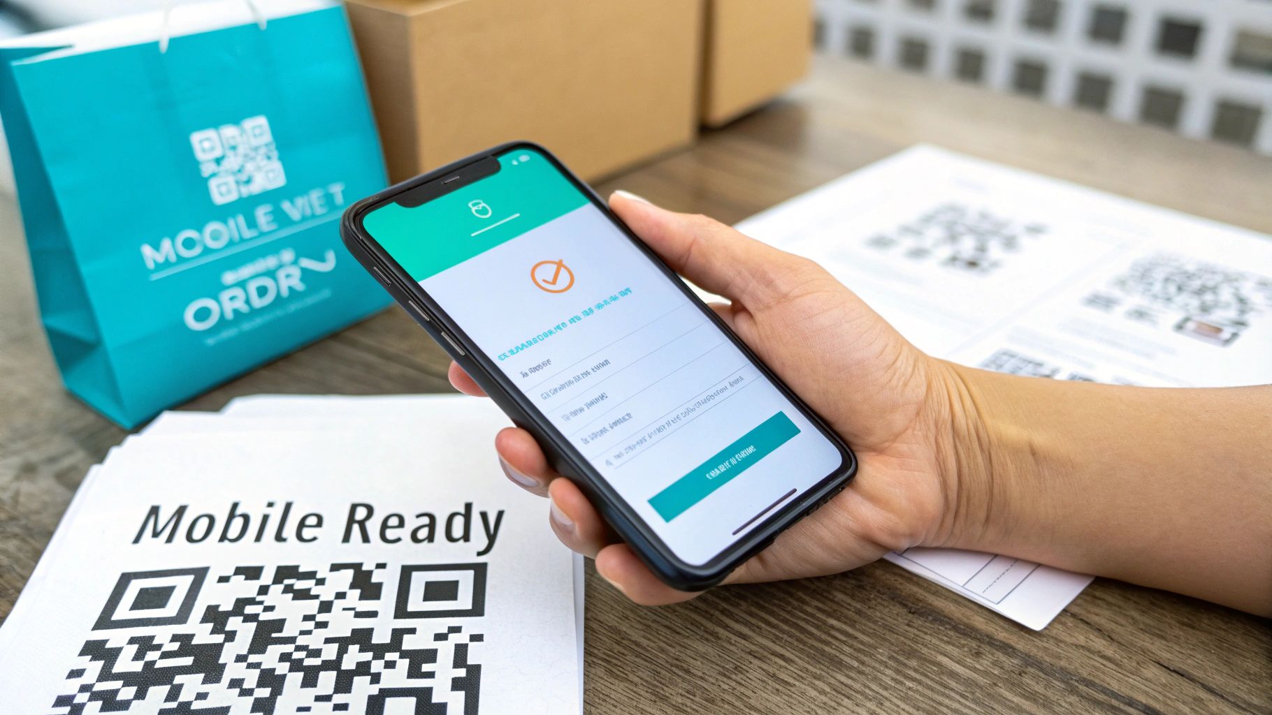
- Use a QR Code: If you have any kind of physical presence—like a booth at a market, a pop-up shop, or even a restaurant—QR codes are fantastic. A customer can just scan the code with their phone and be taken directly to the order form to pay, skipping any lines.
Your Form is Live. Now, Let the Data Do the Talking.
Getting your order form launched is a huge milestone, but don't pop the champagne just yet. The real work—and the real magic—begins now. The most successful businesses I've seen treat their forms less like a static page and more like a living, breathing part of their sales process. It's time to stop guessing what works and start listening to what your customers are telling you through their actions.
From the very first submission, you're collecting a treasure trove of performance data. This is where you shift from building based on gut feelings to making data-backed decisions that can seriously move the needle on your sales.
The Metrics That Actually Matter
It's easy to get overwhelmed by analytics. Instead of drowning in data, zero in on the few key metrics that tell the real story of how people are interacting with your form. Focusing on these will quickly spotlight what's working and, more importantly, what’s broken.
- Completion Rate: This is your north star. It’s simply the percentage of people who start filling out your form compared to those who actually complete the purchase. A low number here is a five-alarm fire telling you there's a point of friction somewhere.
- Drop-Off Points: This is probably the most powerful metric you have. Good analytics will pinpoint the exact field where users are giving up and leaving. Is it when you ask for a phone number? The credit card details? Knowing where they bail is the first step to understanding why.
- Time to Complete: How long is it taking the average person to get through your form? If the answer is several minutes, you're asking for too much. The entire process should feel quick and painless, not like they're filing their taxes.
The data doesn’t lie. If you see that 70% of your abandonments happen right at the payment stage, that's not bad luck. It’s a massive red flag telling you to re-evaluate trust signals, security reassurances, or the payment methods you offer.
From Insight to Action: The A/B Testing Loop
Once you've spotted a problem area, it's time to start experimenting. This is where A/B testing (or split testing) becomes your secret weapon. The concept is straightforward: create two slightly different versions of your form—let's call them 'A' and 'B'—and show them to different groups of visitors. Then, you just see which one performs better.
Let's say you think your main call-to-action button is a little bland. You could run a simple test:
- Version A: "Submit Order"
- Version B: "Get Your Items Now"
By running that test for a week or two, you’ll get hard data on which phrase actually compels more people to click. This isn’t about opinion; it’s about results. You can apply this same process to test everything from your form's layout to the number of fields you require. This continuous cycle of testing and refining is how you take a decent order form and turn it into a high-performance revenue engine for your business.
Got Questions? We've Got Answers
You've got the roadmap for building a killer order form. But as you get your hands dirty, a few questions are bound to pop up. Let's tackle some of the most common ones I hear from people just like you.
How Secure Are Payments Through Formbot?
This is a big one, and rightly so. When it comes to handling payment information, you can't be too careful. The good news is that Formbot integrates directly with payment giants like Stripe.
What this means is that your customer's sensitive financial data never even touches Formbot's servers. The entire transaction happens within Stripe's heavily-fortified, PCI-compliant environment. It’s the best way to ensure total peace of mind for you and your buyers.
Just How Much Can I Customize My Form?
A lot, actually. You have complete control over the form's appearance and, more importantly, its behavior. Think beyond just adding your logo and changing colors.
We're talking about tailoring the entire customer journey:
- Fine-tune your fields: Add, remove, or reorder any question you need. You can also set specific validation rules, like making sure an email address is actually a valid email.
- Create smart forms with logic: Use conditional logic to show or hide questions based on how someone answers. If they select "T-Shirt," you can show them size and color options; if they pick "Mug," those fields stay hidden. It keeps the form clean and relevant.
- Choose the user experience: Do you want a modern, conversational chat-style form? Or maybe a focused, one-question-at-a-time flow? You can even opt for a more traditional layout if that suits your brand.
The real goal here is to pave the smoothest possible path to purchase. Before you add any bells or whistles, ask yourself: "Does this truly make it easier for my customer to complete their order?"
What's the Catch? How Much Does Formbot Cost?
There's no catch. Formbot is designed to grow with your business. You can get started on the Free plan, which lets you build and test your forms without spending a dime. It's perfect for getting things dialed in.
Once you see the results and your order volume increases, you can upgrade to a paid plan for more advanced features and a higher number of submissions. The full breakdown is on the Formbot pricing page, so you can find the perfect fit for where your business is at in 2026.
Ready to ditch that clunky old order form for something that actually drives sales? With Formbot, you can build a beautiful, high-converting order form in just a few minutes.
Start building for free at tryformbot.com and see the difference it makes.


