
At its core, mobile-first design is a straightforward concept: you start designing for the smallest screen first—a smartphone—and then scale up to tablets and desktops. Imagine building a tiny, highly functional cabin before attempting a sprawling mansion. You figure out the absolute essentials first, ensuring the core structure is solid before you start adding extra rooms and luxuries.
This approach forces you to be ruthless about prioritizing what truly matters to your users.
From Crowded To Clean: The Mobile-First Philosophy
Ever tried to navigate a cluttered, complicated website on your phone? It's a mess of pinching, zooming, and accidentally tapping the wrong tiny link. That frustrating experience is almost always the result of a "desktop-first" design, where a huge, feature-packed website is simply squashed down to fit a small screen. It’s like trying to stuff a king-sized mattress into a Mini Cooper—it just doesn't work.
Mobile-first design flips that entire process on its head. When you start with the constraints of a mobile screen, you're forced to focus on the essentials. What’s the number one thing a user needs to do here? What's the most critical piece of information they need? This constraint isn't a limitation; it’s a filter that leads to a cleaner, faster, and more intuitive user experience.
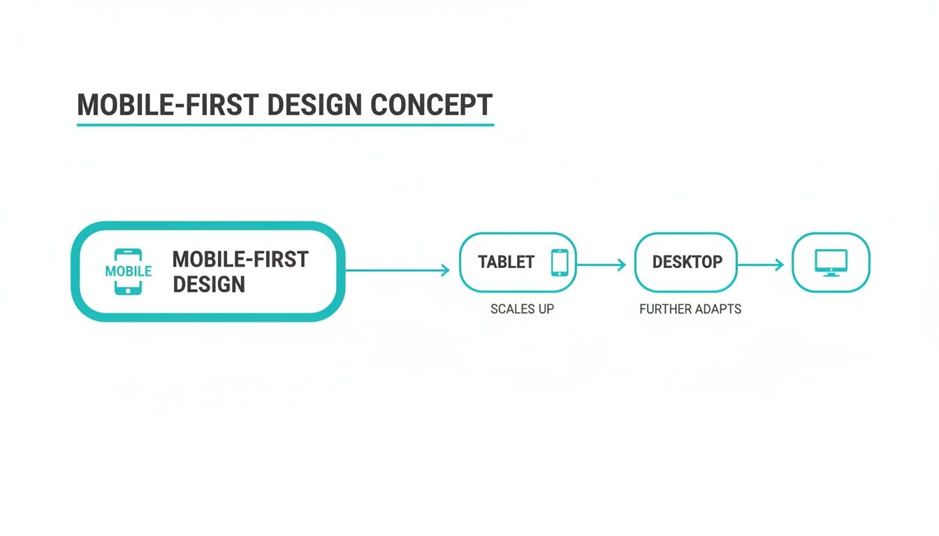
The Power Of Progressive Enhancement
The engine behind this strategy is a principle called progressive enhancement. Instead of building a complex desktop site and then stripping features away for mobile (a method called "graceful degradation"), you do the opposite. You start with a lean, functional mobile base and then progressively add more features and complexity as the screen real estate grows.
- On Mobile: You deliver the core content and essential functions, all perfectly optimized for a small, touch-based interface.
- On Tablet: With a bit more room, you can introduce secondary navigation, richer visuals, or extra content without overwhelming the user.
- On Desktop: Now you have the space to pull out all the stops—complex layouts, high-resolution media, and advanced features that would be impossible on a phone.
This flowchart neatly visualizes how the design expands from a constrained environment to a feature-rich one.
The idea is to build a solid foundation that works brilliantly everywhere, starting with the device in everyone's pocket. For a deeper dive into the fundamentals, this guide on What Is Mobile First Design is a fantastic resource.
Given that mobile traffic is only growing, this isn’t just a "nice-to-have" in 2026. It’s a core business strategy. Getting this right has a direct impact on your bottom line, which is a key theme in our article on how to increase website conversion rates.
Mobile-First vs Responsive vs Adaptive Design
While these terms are often used interchangeably, they represent distinct philosophies for tackling multi-device design. Mobile-first is a strategy, while responsive and adaptive are methods of implementation.
| Approach | Core Philosophy | Starting Point | Best For |
|---|---|---|---|
| Mobile-First | Start with the essentials and add complexity as screen size increases. | Mobile screen | Almost all new projects, as it forces content prioritization and improves performance. |
| Responsive | One flexible layout that fluidly adjusts to any screen size. | Usually desktop (but can be mobile) | Content-heavy sites like blogs and news portals where a consistent experience is key. |
| Adaptive | Multiple fixed layouts are created for specific device screen sizes. | No single starting point | Complex web apps that need a highly tailored experience for a few key device types. |
Understanding these differences helps you choose the right path for your project. While responsive design can look like mobile-first, a true mobile-first approach shapes the entire project from the very beginning, influencing not just the layout but the content and features themselves.
The Journey From Desktop-First to Mobile-First
To really get why mobile-first design is such a big deal, you have to rewind the clock a bit. Back in the early 2000s, web design was purely a desktop game. We built sites for big monitors, assuming everyone had a fast, wired internet connection. The thought of browsing a full-fledged website on a tiny phone screen? Pure science fiction.

This desktop-first mindset worked just fine until smartphones blew up. All of a sudden, those sprawling, feature-heavy websites were being shoehorned onto tiny screens. It was a usability nightmare—endless pinching, zooming, and hunting for buttons.
The first real solution was responsive design, a brilliant method that let a single website automatically adjust its layout for different screen sizes. It was a huge leap forward, but it often meant the mobile experience was just a stripped-down, squished version of the "real" desktop site. The core thinking was still desktop-centric.
The Turning Point: Google's Big Move
The true mindset shift happened when the user data became too loud to ignore. People weren't just dabbling in mobile browsing; it was rapidly becoming their main way of getting online. This all came to a head with a massive change that shook the worlds of web design and SEO.
In March 2018, Google officially started rolling out mobile-first indexing. In simple terms, this meant Google would now primarily look at the mobile version of a site to understand and rank it in search results. The mobile experience was no longer secondary—it was the priority.
This wasn't a random decision; it was a direct reflection of reality. Mobile-first design wasn't just a smart idea anymore; it was essential for survival.
Fast forward to today, and the numbers speak for themselves. Mobile devices account for a significant majority of all web traffic worldwide. For local businesses like restaurants or retail shops, that number can be even higher. If you'd like to dig deeper, you can discover more insights about why mobile-first matters now more than ever.
The path from a desktop-centered internet to a mobile-dominated one was a slow burn, but the outcome was decisive. This history shows us that mobile-first isn't just a fleeting trend. It's a fundamental strategy that grew out of how we all actually use technology today—meeting people right where they are, with a screen in the palm of their hand.
The Business Case For A Mobile-First Strategy
Adopting a mobile-first strategy is much more than a design trend or a simple facelift for your website. It’s a direct investment in your bottom line. When you put the experience of your mobile users first—and let's be honest, that's most of them—you create a clearer, faster path from browsing to buying.
Think about the last time you gave up on a website while on your phone. Was it slow? Hard to tap the right button? Too cluttered? Those little moments of frustration are conversion killers, sending potential customers straight to your competition. A mobile-first approach is designed to systematically wipe out those friction points, keeping people engaged and happy.
Driving Revenue And Efficiency
The financial upside of thinking small screen first is huge. By concentrating on the absolute must-haves from the very beginning, the whole development process becomes leaner and more focused. This not only saves you money but gets your product out the door faster, which is always a good thing.
The numbers speak for themselves. Companies that build with a mobile-first mindset are positioned for greater efficiency and return on investment. With a significant portion of all web traffic now coming from mobile devices, it’s no surprise that apps and websites built this way see positive impacts on revenue. You can read more about these impressive mobile-first findings here.
A mobile-first strategy isn't just about saving money; it's a revenue-generating engine. When you meet customers on their favorite device with an experience that just works, you're laying the groundwork for real, sustainable growth.
The Undeniable SEO Advantage
Beyond keeping your users happy, going mobile-first is absolutely critical for being seen on search engines. Ever since Google switched to mobile-first indexing, the mobile version of your site is what it considers the real version for ranking. If your mobile site is a slow, stripped-down afterthought, your search rankings will take a hit everywhere.
This means a well-built mobile experience gives you a serious SEO leg up. The benefits are clear:
- Improved Rankings: Google flat-out favors mobile-friendly websites, pushing them higher in search results.
- Better Core Web Vitals: Mobile-first sites are naturally lighter and faster, helping you nail performance metrics like Largest Contentful Paint (LCP) and Cumulative Layout Shift (CLS).
- Increased Organic Traffic: When you rank higher and provide a better experience, you get more clicks and more traffic from search. Simple as that.
In the end, the business case is crystal clear. A mobile-first approach isn't a "nice-to-have" anymore. In 2026, it is the single most effective way to improve user experience, boost conversions, supercharge your SEO, and run a more efficient operation.
Applying Mobile-First Principles To Web Forms
For most businesses, web forms are where the magic happens. They’re how you capture leads, gather feedback, and close sales. But on a phone, a clunky form is often a dead end for the user. Applying a mobile-first mindset to your forms means being ruthless about simplicity, making the experience feel effortless instead of like a chore.
Think about it: the classic desktop form, with its multiple columns and endless rows of fields, just doesn’t work on a small touchscreen. People are forced to pinch, zoom, and try to tap tiny boxes with their thumbs. It’s no wonder so many just give up. A mobile-first approach completely flips the script by starting with a clean, single-column layout, making sure every element is easy to see and interact with.
Designing For The Thumb Zone
When you design a form for mobile, you have to consider how people actually hold their phones. The most important buttons and fields need to be right where the thumb can easily reach them. This isn't just about the layout; it's about making the entire process feel natural and comfortable.
Here are a few core ideas to keep in mind for great mobile-first form design:
- Large, Touch-Friendly Inputs: Make every field, checkbox, and button big enough to be tapped easily with a fingertip. This simple change cuts down on frustrating mis-taps and accidental submissions.
- Prioritize Essential Fields: Mobile users are short on patience. Only ask for the information you absolutely need right now. Every single field you add is another reason for someone to abandon the form.
- Use Mobile-Specific Keyboards: Set up your input fields (like
type="email"ortype="tel") to automatically pull up the right keyboard. It's a small detail that saves users from having to manually switch back and forth. - Keep It To One Column: A single-column layout is the gold standard for mobile forms. It creates a simple, straight line for the user to follow, eliminating any confusing horizontal scrolling.
This one-question-at-a-time method is a perfect example of mobile-first design in action. It makes the whole process feel much less intimidating from the start.
As you can see, a conversational form presents one clear question at a time, much like a text message. This design naturally aligns with mobile-first principles by lowering the user's mental workload and keeping them focused on one simple task.
How Conversational Forms Embrace Mobile-First
Tools like Formbot take these mobile-first ideas to their logical conclusion. Instead of just shrinking a traditional form for a smaller screen, Formbot completely reimagines the experience as a conversation. This approach is a natural fit for mobile devices, where people are already used to chat interfaces.
A conversational form is the ultimate expression of mobile-first design for data collection. It breaks down a long, intimidating form into a series of simple, bite-sized questions, feeling more like a friendly chat than a tedious task.
This one-question-at-a-time flow gets rid of the overwhelming "wall of text" that makes so many mobile forms a nightmare. It gently guides the user through the process, which feels faster and is far more engaging.
By presenting information this way, businesses can see a lift in completion rates. To dig deeper, check out our guide on essential web form design best practices. By truly embracing simplicity and focus—the core of mobile-first design—you can transform your forms from a major point of friction into your most powerful conversion tool.
Your Mobile-First Design Project Checklist
Okay, let's move from theory to action. Having a solid checklist is the best way to make sure your mobile-first principles actually make it into the final product. It turns abstract ideas into a concrete to-do list, keeping everyone—from designers to developers—on the same page.
Think of this as more than just a list to tick off. It's a tool to reorient your team's thinking, forcing everyone to put the mobile user front and center at every step.

Start with Content Strategy
Before anyone even thinks about drawing a wireframe, you need to nail down the content. On mobile, this means being absolutely ruthless about what stays and what goes.
- Pinpoint Core User Goals: What are the top 1-3 things a user absolutely must be able to do on this page? Get crystal clear on this first.
- Prioritize Above-the-Fold: Is the most important piece of information and the main call-to-action visible the second the page loads? No scrolling required.
- Simplify Your Copy: Read every sentence out loud. Is it concise? Is it scannable? Dense paragraphs are a no-go on small screens. They absolutely kill conversions.
Nail the UX and UI Design Essentials
Once you know what content is most important, you can start designing an interface that feels natural to use with your thumbs.
- Make Tap Targets Generous: All buttons, links, and interactive elements should be at least 44x44 pixels. This simple rule prevents so much user frustration from accidental taps.
- Design for the Thumb Zone: Are your key navigation buttons and CTAs placed where a thumb can easily reach them? Don't make people stretch.
- Use Legible Typography: Your body text should be at least 16px. Anything smaller is a struggle. Also, check that your text-to-background contrast is high enough to be read easily, even in bright sunlight.
Focus on Performance and Testing
A gorgeous mobile design that's slow or broken is completely useless. Performance can't be an afterthought; it has to be a priority from the very beginning.
With mobile traffic consistently representing a majority of web traffic, the game has fundamentally changed. By 2026, mobile-first won't just be a good idea—it will be the standard. Starting small and building up is the only path forward.
Rigorous testing is non-negotiable. You have to make sure your site works for everyone, on every device. As you wrap up, remember that proper debugging on iOS Safari is especially critical, as it can have its own unique quirks. And for more tips on maximizing your results, our guide on landing page optimization best practices can help you fine-tune your approach before launch.
Still Have Questions? Let's Clear Things Up

Even after laying out a strategy, a few common questions always seem to surface when teams start talking about mobile-first design. Let's tackle them head-on so you can move forward with confidence.
Is Mobile-First Design Just Another Name for Responsive Design?
That’s a great question, and the short answer is no. While they're closely related, they are fundamentally different approaches.
Think of responsive design as the technical magic that makes a website’s layout automatically adjust to different screen sizes. It’s like pouring water into different shaped glasses—it adapts.
On the other hand, mobile-first design is a creative strategy. It means you design the entire experience for the smallest screen first and then work your way up. A project built with mobile-first principles will always be responsive, but a responsive site wasn't necessarily built mobile-first.
Does Going Mobile-First Mean We Should Ignore Desktop Users?
Absolutely not. This is a common myth that trips people up. It's about prioritization, not elimination. The core idea here is something called 'progressive enhancement'.
You start by building a rock-solid, streamlined foundation for your mobile users. Then, you layer on more complex features, richer content, and expansive layouts for larger screens. The desktop experience is still vital; it just grows from that strong mobile foundation, ensuring the core user journey is perfect everywhere.
How Can I Get My Team On Board with This Shift?
Let the numbers do the talking. The most powerful argument you have is your own website analytics. Show your team exactly what percentage of your traffic is already coming from mobile devices. Given that mobile traffic is the dominant force, the data likely already supports the switch.
Frame it as a strategic move to meet your customers where they are. Highlight the tangible business wins: better SEO rankings thanks to Google's mobile-first indexing, higher mobile conversion rates, and a more focused, efficient development process.
Ready to transform your data collection with a true mobile-first approach? Formbot helps you build conversational forms that feel intuitive on any device, boosting completion rates and delivering a better user experience. Start creating smarter, mobile-friendly forms today at https://tryformbot.com/pricing.